Our Range































A Guide to Grout Colours: How One Detail Transforms Any Tile
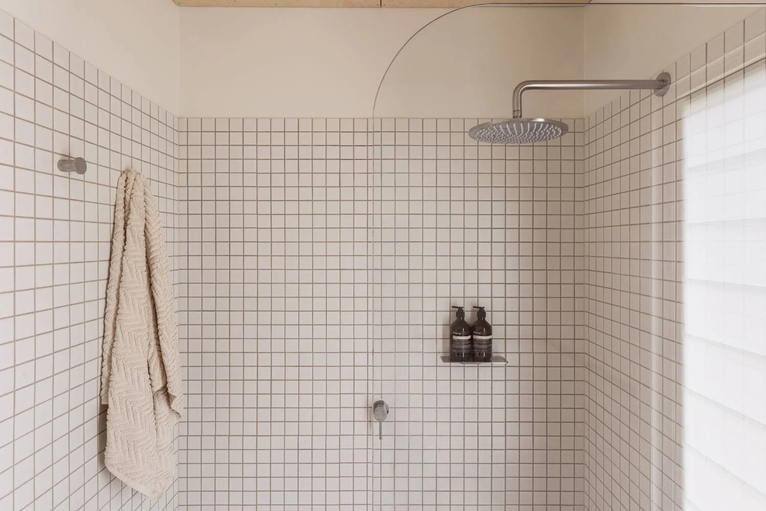
Transform any tile with grout colours, from the subtle sophistication of tonal beige and soft grey to the bold contrast of blue, green or even red. Whether your tiles are laid in an intricate mosaic, generous grid or classic stacked pattern, the installation may stay the same, but the aesthetic can be completely changed by grout colour.
Even with the perfect tile, premium materials and expert installation, treating grout as an afterthought means overlooking one of the most defining design decisions. It's the same tile, the same labour, yet the finished result can feel completely different.
For many projects, grout colours are simply defaulted to white or grey. It's a practical choice made on autopilot rather than a deliberate design decision. Whether you want to make a space feel larger, highlight the geometry of a tile pattern or create a seamless, uninterrupted finish, choosing colour grout intentionally is what separates a thoughtfully considered interior from a standard one.
What Grout Can Create
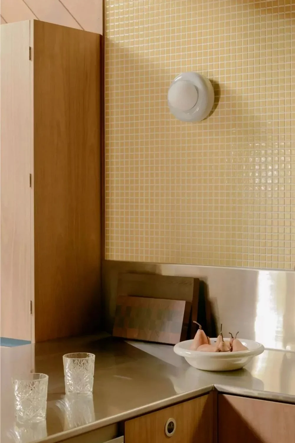
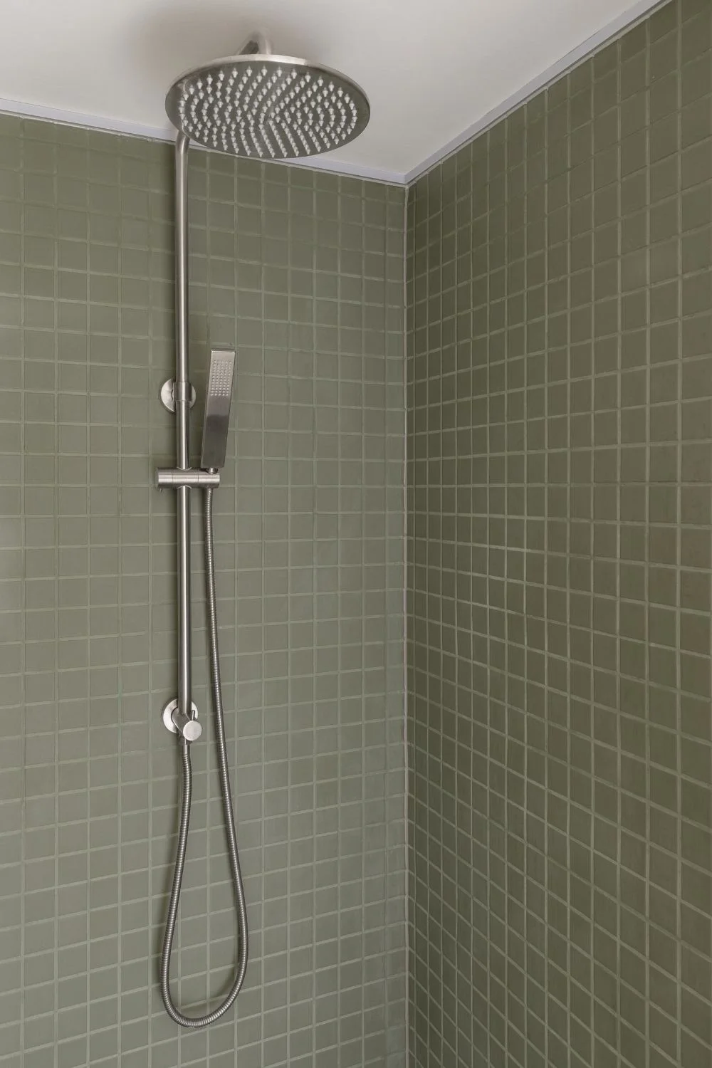
Choosing grout colours typically falls into one of three relationships with the tile. Picking the relationship first, before the exact shade, is what keeps the decision deliberate.
Blend
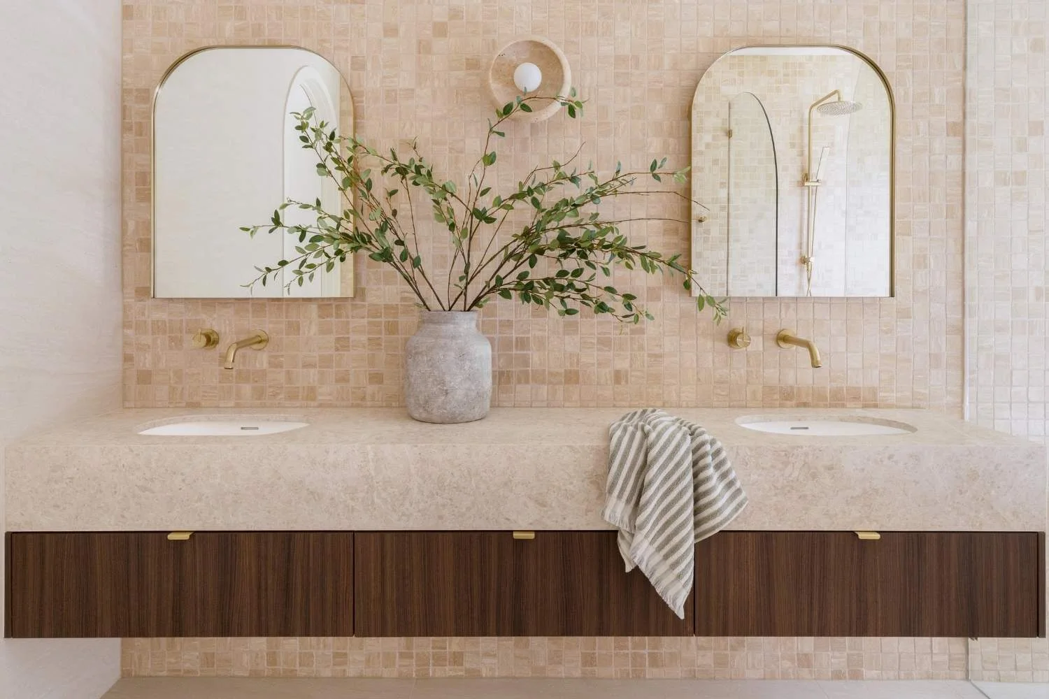
A grout that matches the tile creates a seamless, expansive surface where the grid disappears, and the tile's own pattern, veining, or texture is free to lead. Blending is ideal for feature tiles you want to show off uninterrupted, natural stone tiles where the movement is the whole point, and small rooms that need to feel bigger.
Contrast
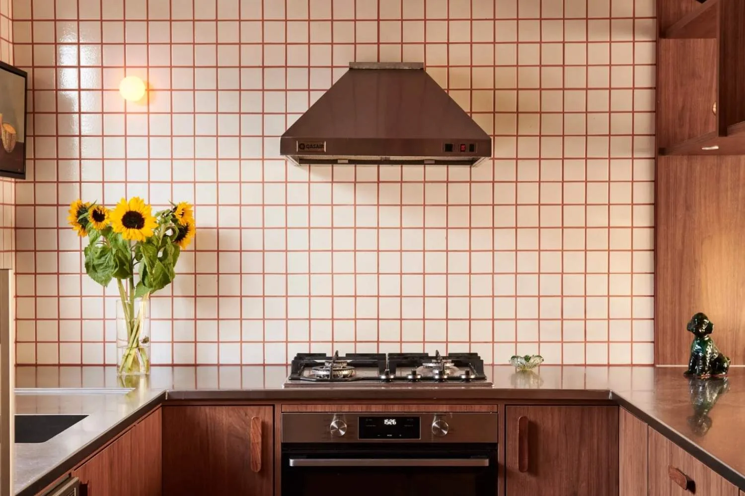
A grout that deliberately opposes the tile turns a plain grid into a graphic pattern. Contrast emphasises shape, making for a crisp and intentional look. It's the choice when you want the tile layout to be the design, not just the backdrop.
Tonal
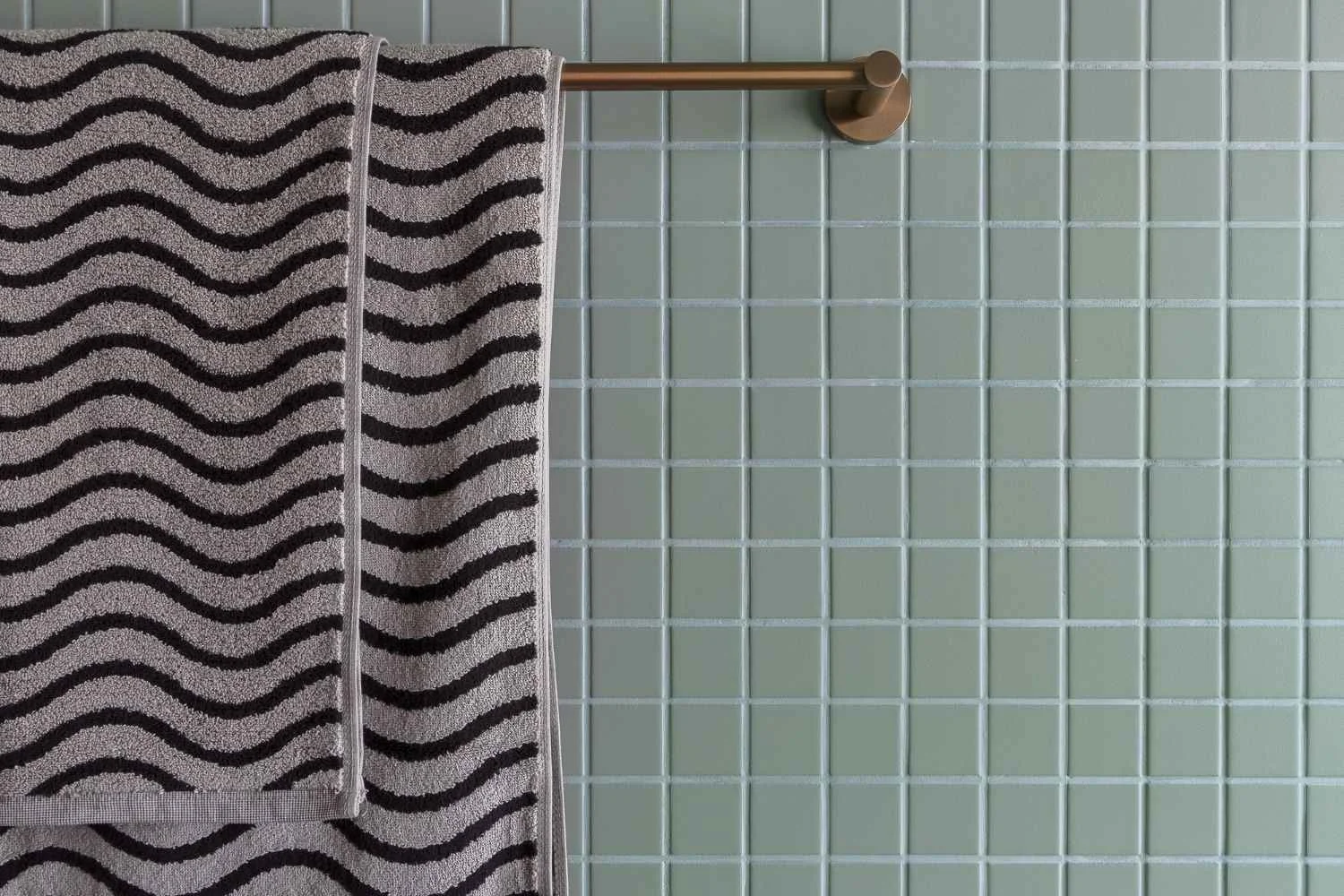
A grout that sits a half-shade from the tile, slightly deeper, slightly softer, gives you quiet depth without commitment, where the grid is gentle rather than loud. Tonal is the sophisticated middle ground and the safe option when you can't decide between blend and contrast.
Room by Room
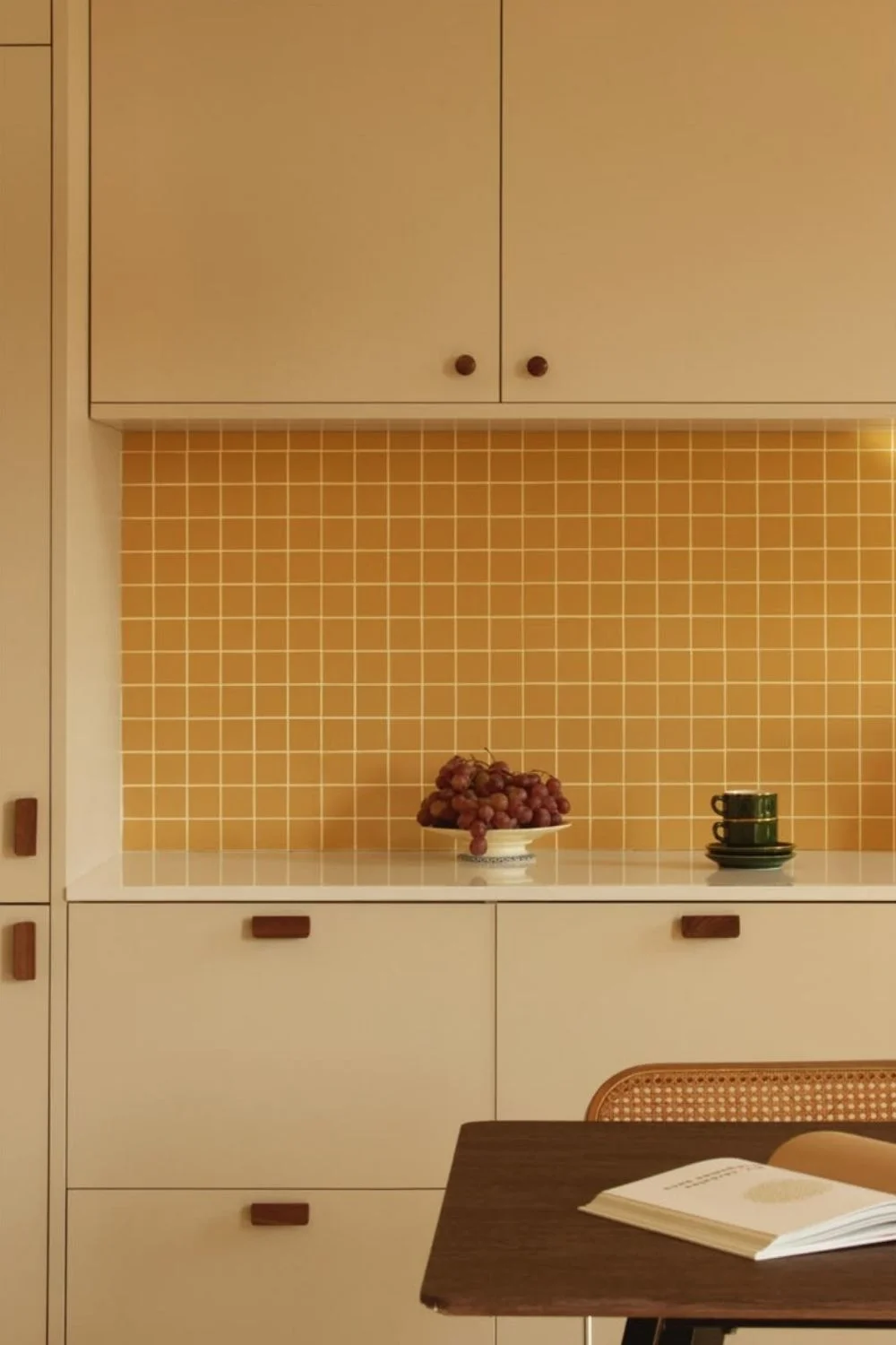
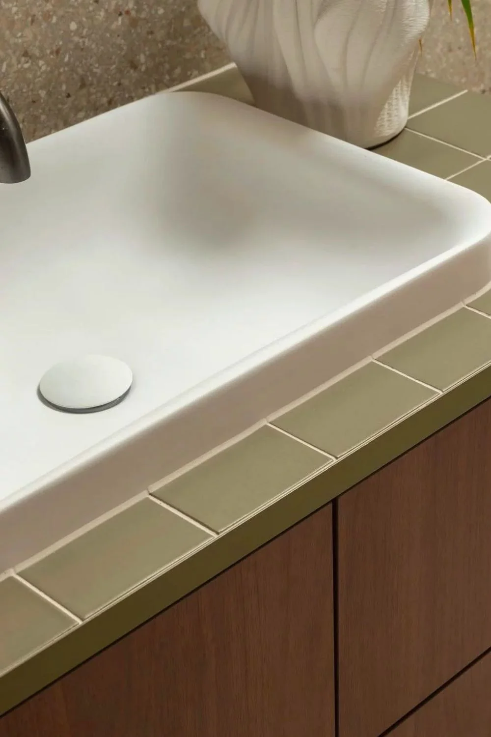
The right grout relationship depends on where you're tiling and how that surface performs day to day. Splashbacks are among the most forgiving areas in the home. With minimal foot traffic, fewer stains and an easy-to-clean surface, they're the perfect place to experiment with contrasting grout or introduce a subtle hit of colour you might not choose elsewhere.
Bathroom walls and floors call for different grout colours. On walls, lighter grout keeps the space feeling bright, open and expansive, while on floors, mid-to-dark tones are often the more practical choice, subtly disguising water marks, soap residue and everyday foot traffic between cleans.
Wet areas call for a more practical approach. Darker or properly sealed grout stands up better to soap scum and mould than bright white, which tends to highlight every mark. The same applies to kitchen floors and other high-traffic areas, where mid-greys, taupes and deeper tones maintain a cleaner appearance between washes. Outdoors, choose mid-tone grout that can better disguise dirt while ageing more gracefully in the face of UV exposure and the elements.
What Earthy Palettes Ask For
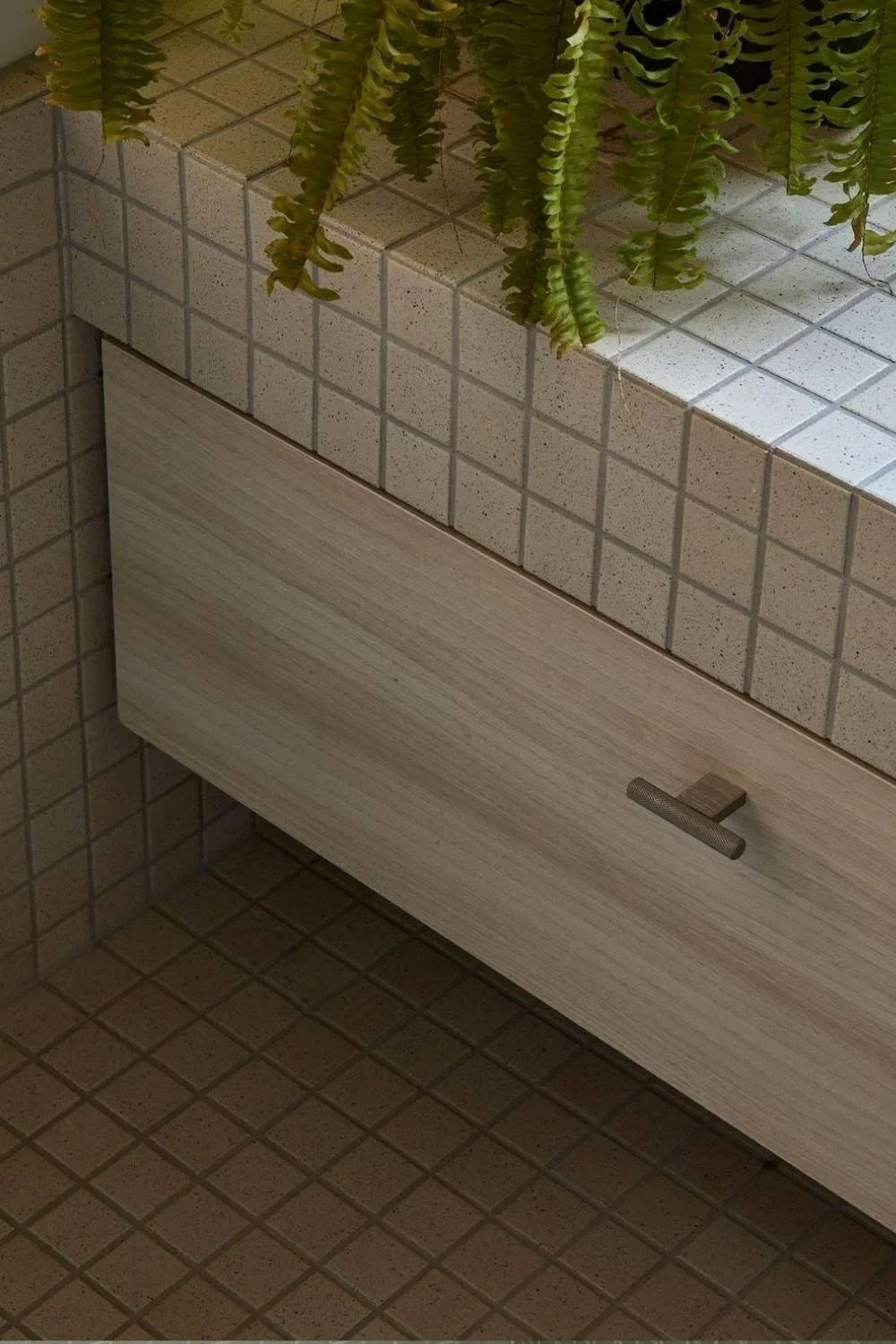
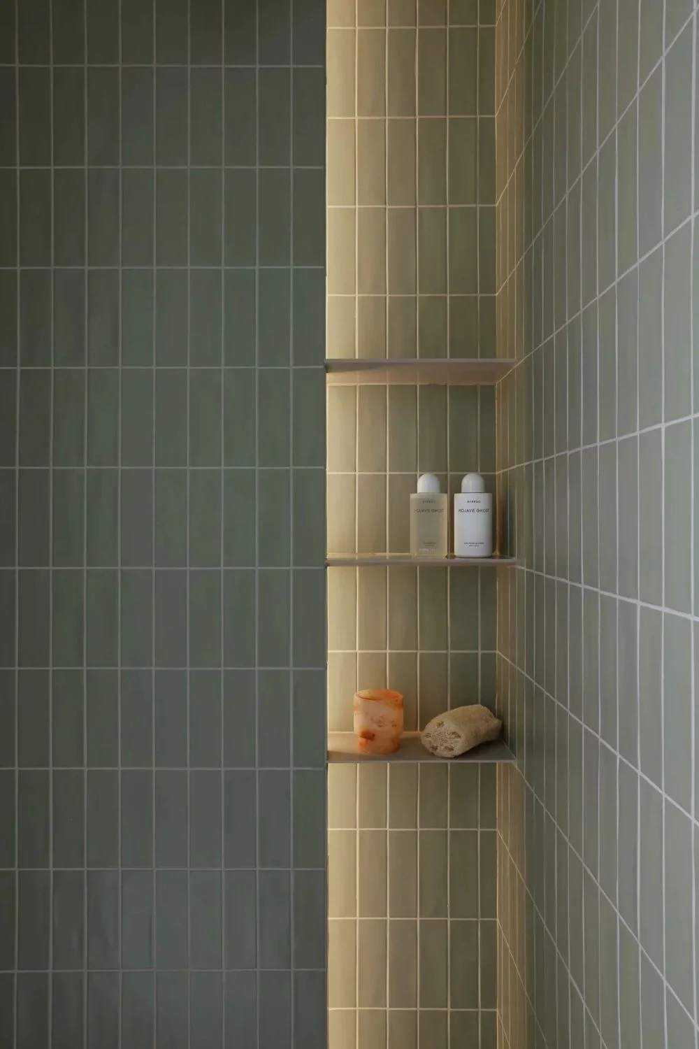
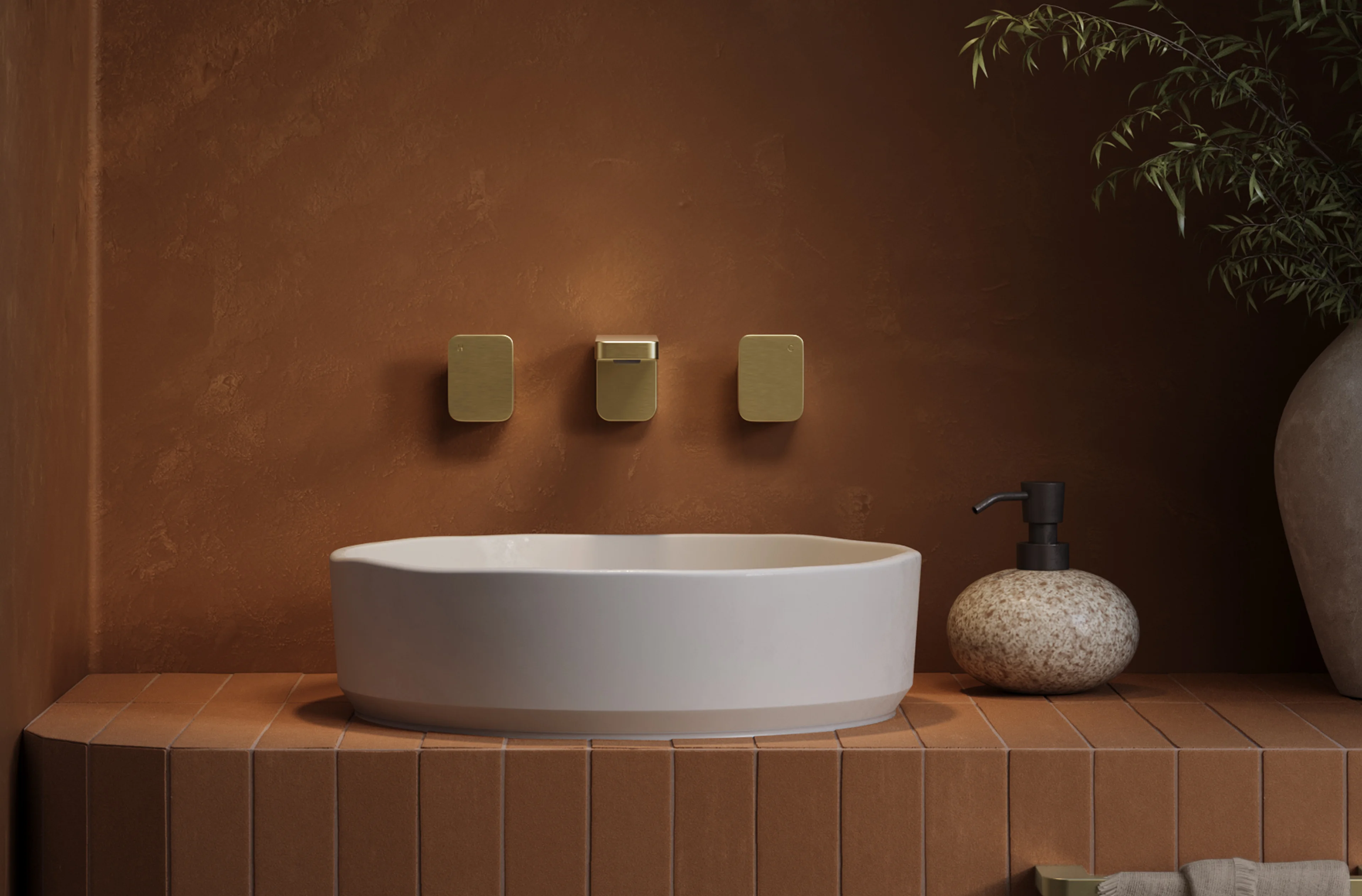
Earthy grout colours, from terracotta and clay to ochre, rust and warm browns, bring a grounded, sun-warmed character to tiled spaces. They pair beautifully with natural materials such as zellige, raw or honed stone, and handmade tiles, where a cool grey grout would compete with the warmth of the surface rather than complement it.
They're also an understated way to introduce colour without changing the tile itself. Paired with beige, cream or sand tiles, earthy grout creates depth and personality, giving an otherwise neutral palette a relaxed Mediterranean feel or desert-inspired warmth while maintaining a timeless, tonal aesthetic.
A Two-Tone Approach
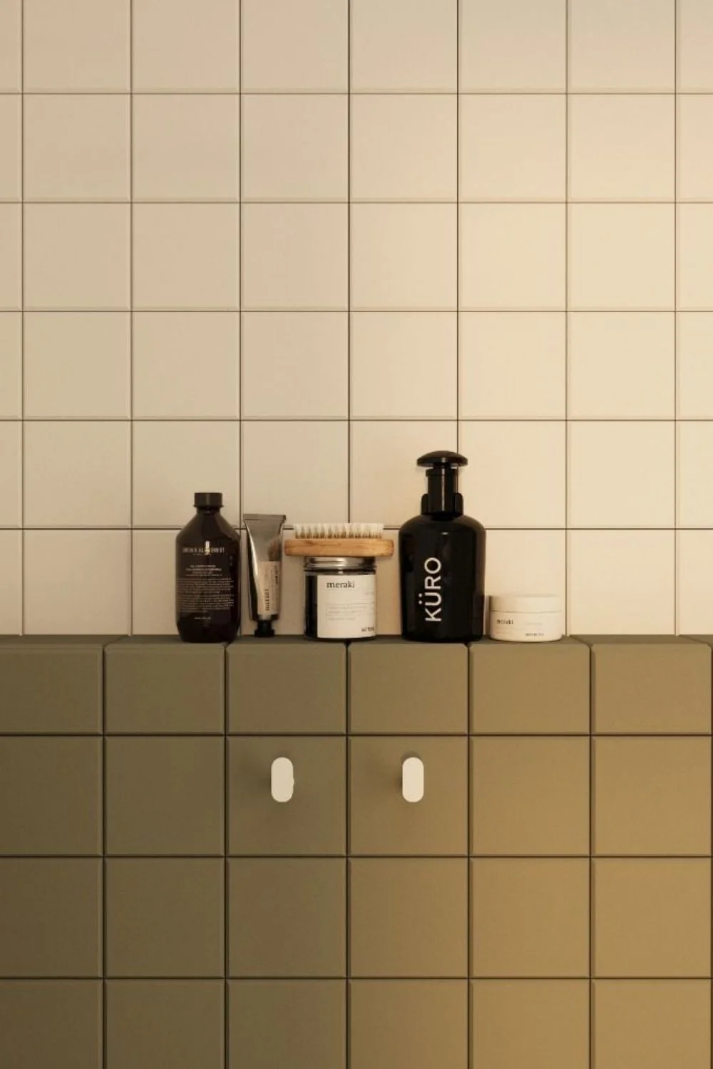
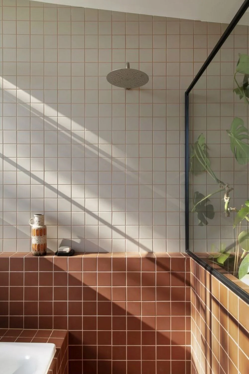
Using opposing colours in a complementary way, such as a half-and-half wall design, or pairing one tile colour with a contrasting grout before reversing the combination on an adjoining surface, is a simple yet clever way to introduce character. This playful approach creates visual interest and definition while maintaining a cohesive palette that feels balanced rather than bold.
Where White Works Well
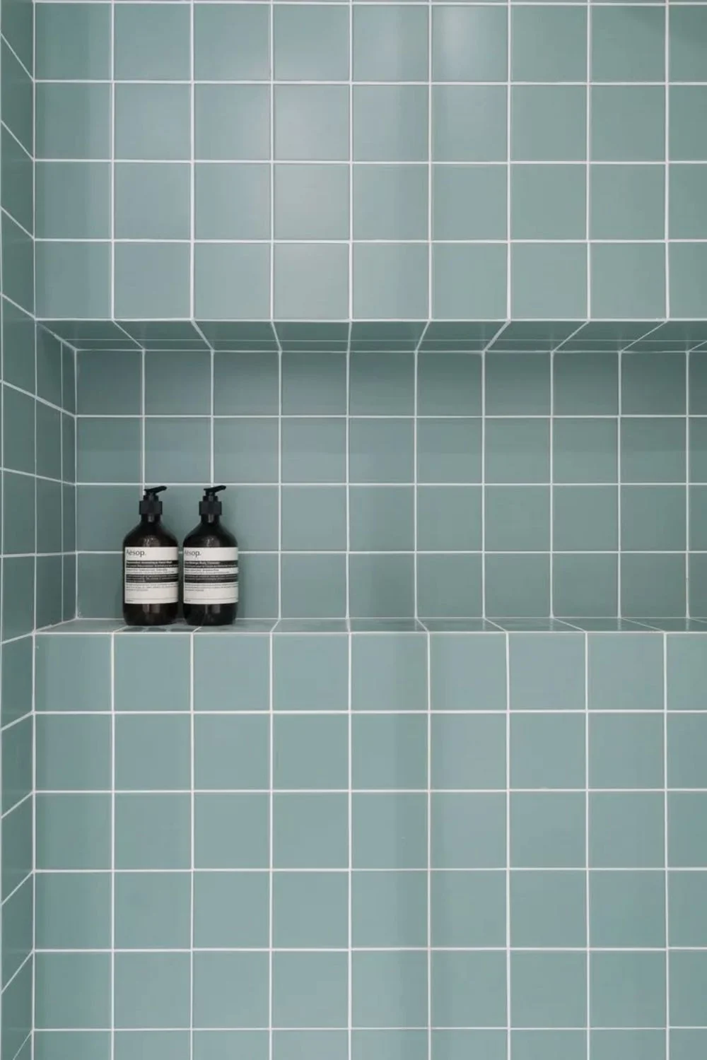
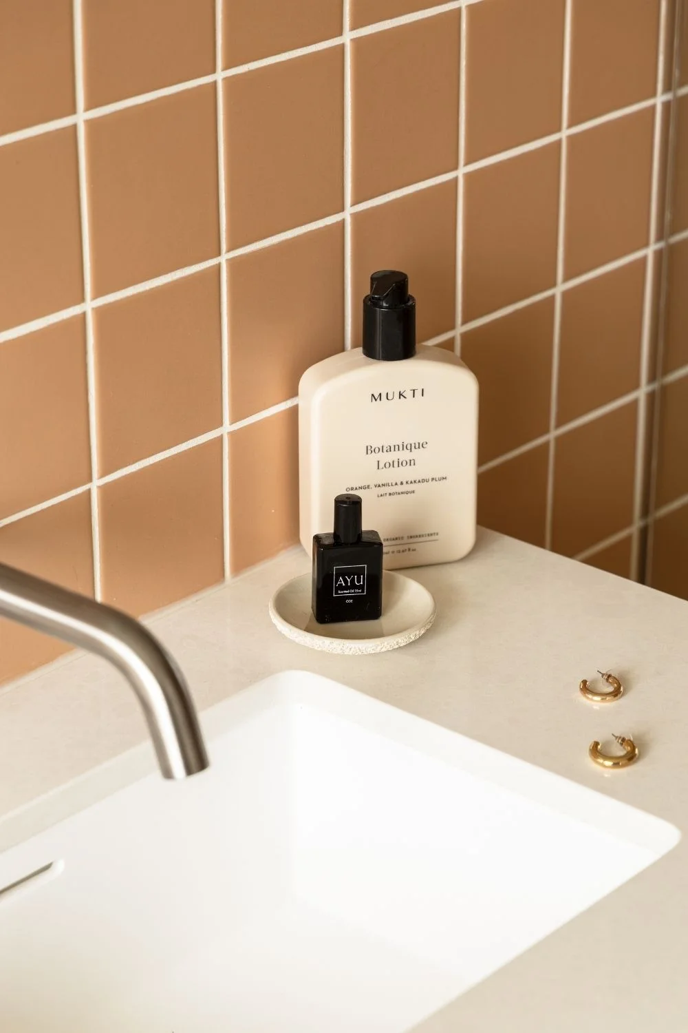
White grout still has its place; the key is pairing it with the right tile and using it in the right setting. It works particularly well with coloured mosaics, where a crisp white outline allows each tile to stand out, enhancing the vibrancy of the colour while keeping the overall look fresh and defined.
The trade-off, however, is maintenance. White grout performs best in lower-traffic, lower-splash areas where it can retain its crisp appearance with minimal upkeep. Think feature walls, splashbacks, powder rooms and decorative borders. Used in the right place, white grout creates a timeless, bright and light-filled finish that complements the tile without demanding constant attention.
2026 Trends
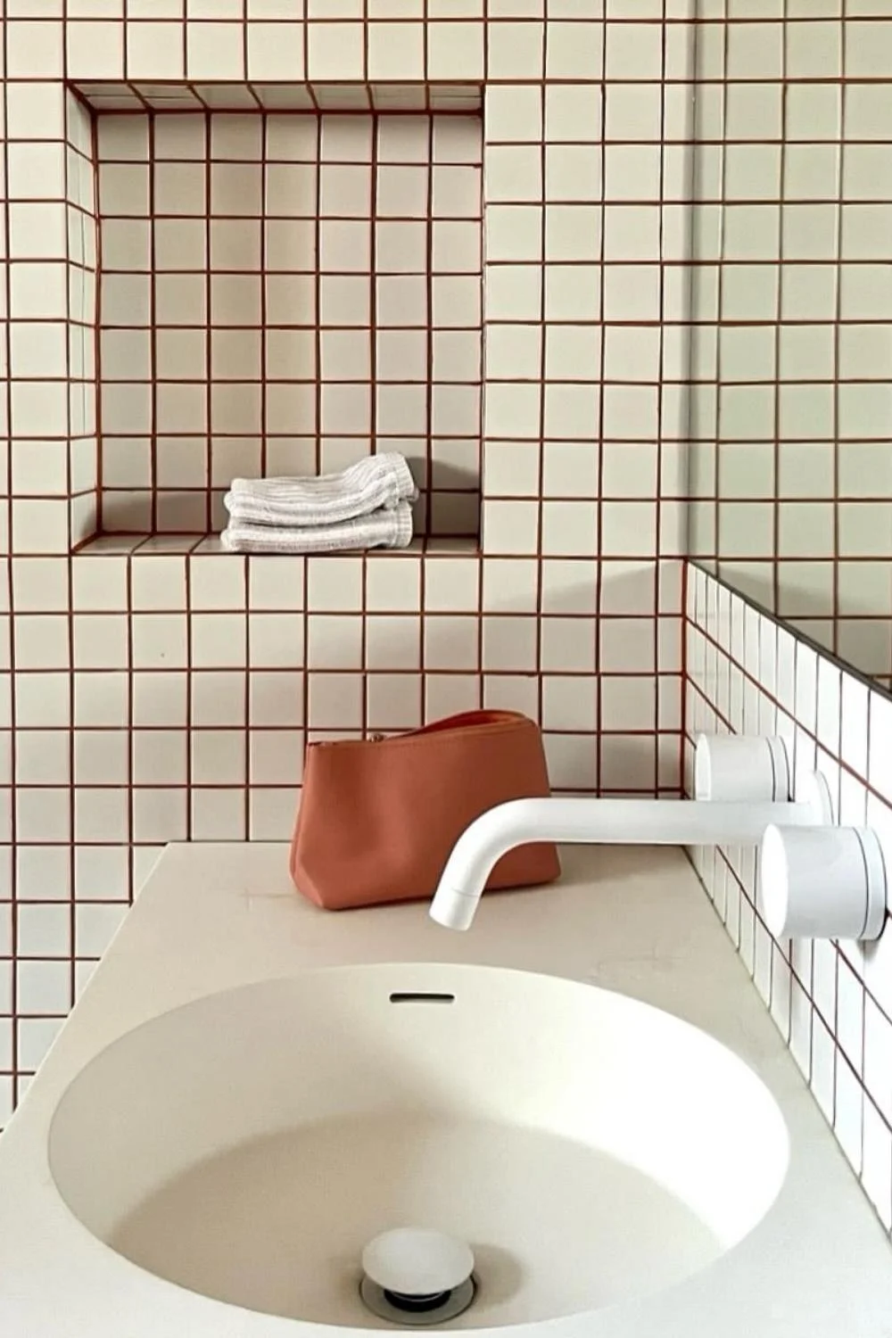
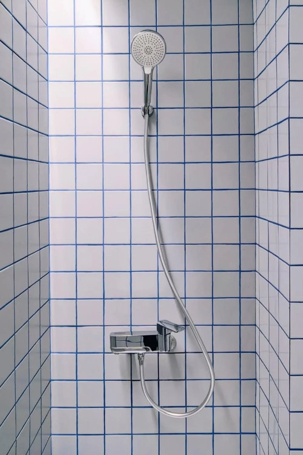
If there's one defining grout trend for 2026, it's that grout has become a design feature in its own right. Rather than disappearing into the background, grout is now being used to introduce colour, contrast and personality. Leading the shift is the pairing of white or neutral tiles with coloured grout, allowing the grout lines themselves to carry the colour story while the tile remains timeless and understated.
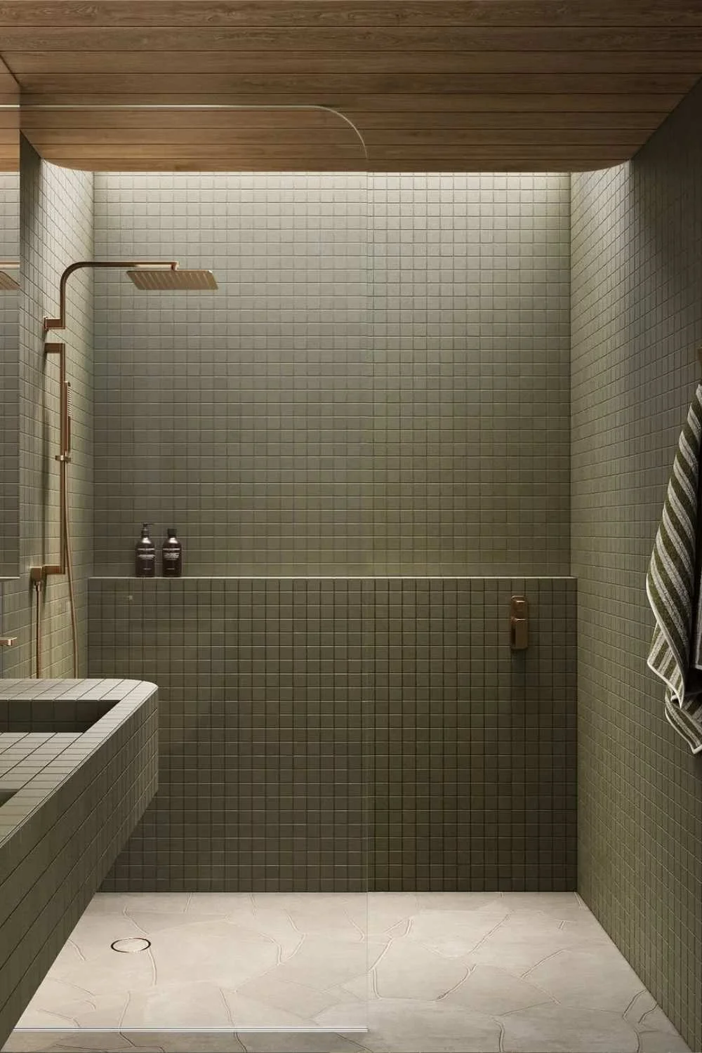
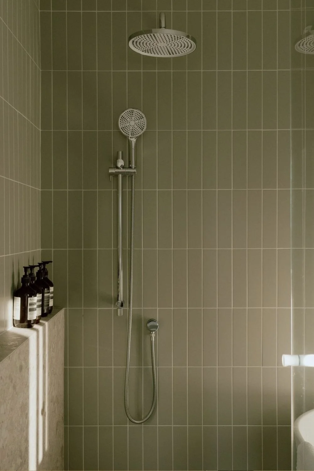
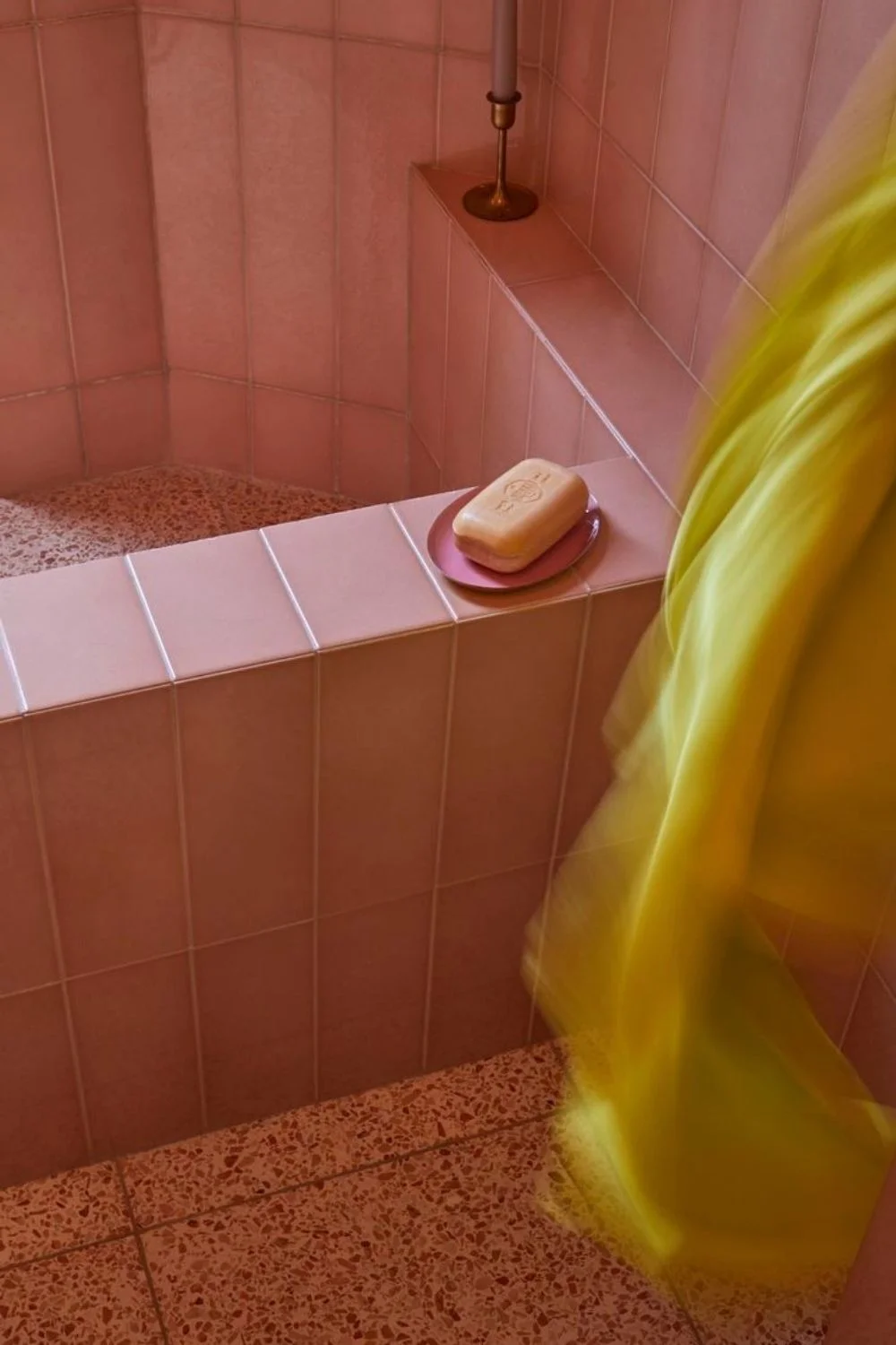
Sage and olive greens continue to gain popularity, bringing an organic feel that complements zellige, handmade and artisan tiles beautifully. Blush and dusty pinks are also emerging as sophisticated neutrals, offering warmth and subtle character without overwhelming a space.
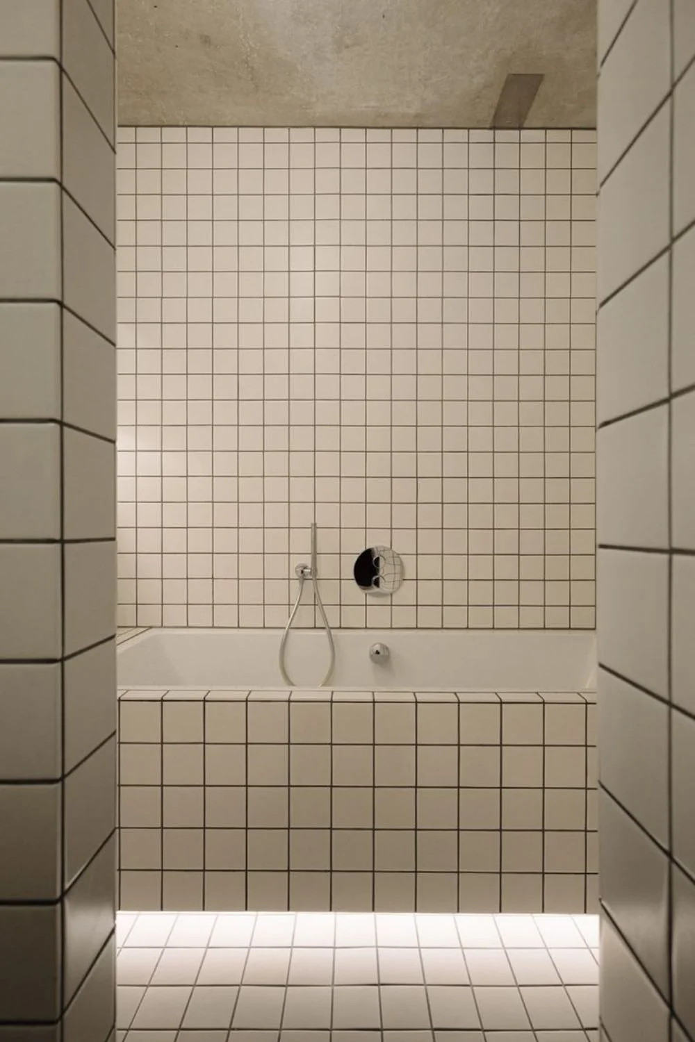
For those seeking a more dramatic finish, charcoal, espresso, and navy grout create depth and definition while offering the practical advantage of disguising everyday dirt and wear. Grout varies in composition as well as colour, with cement-based grout being the standard choice, available sanded for wider joints and floors, or unsanded for narrow joints and delicate surfaces. Epoxy grout offers superior stain resistance, water resistance and colour stability, although it is more expensive and requires specialist installation. As a general rule, cement grout suits most everyday applications, while epoxy is the premium choice where durability and longevity matter most.
Yet regardless of the colour, the defining trend for 2026 is intention. What may seem like a small finishing detail ultimately becomes one of the most influential design decisions, shaping the overall character, atmosphere and longevity of the space. Our Tiles Collection makes it easy to bring these grout pairings to life, with a curated selection of tiles in a wide range of colours, textures and styles — explore the range in-store or online today.
For more tile inspiration, read these blogs:
Colour Tiles Are Back: The Return of Character in Contemporary Interiors