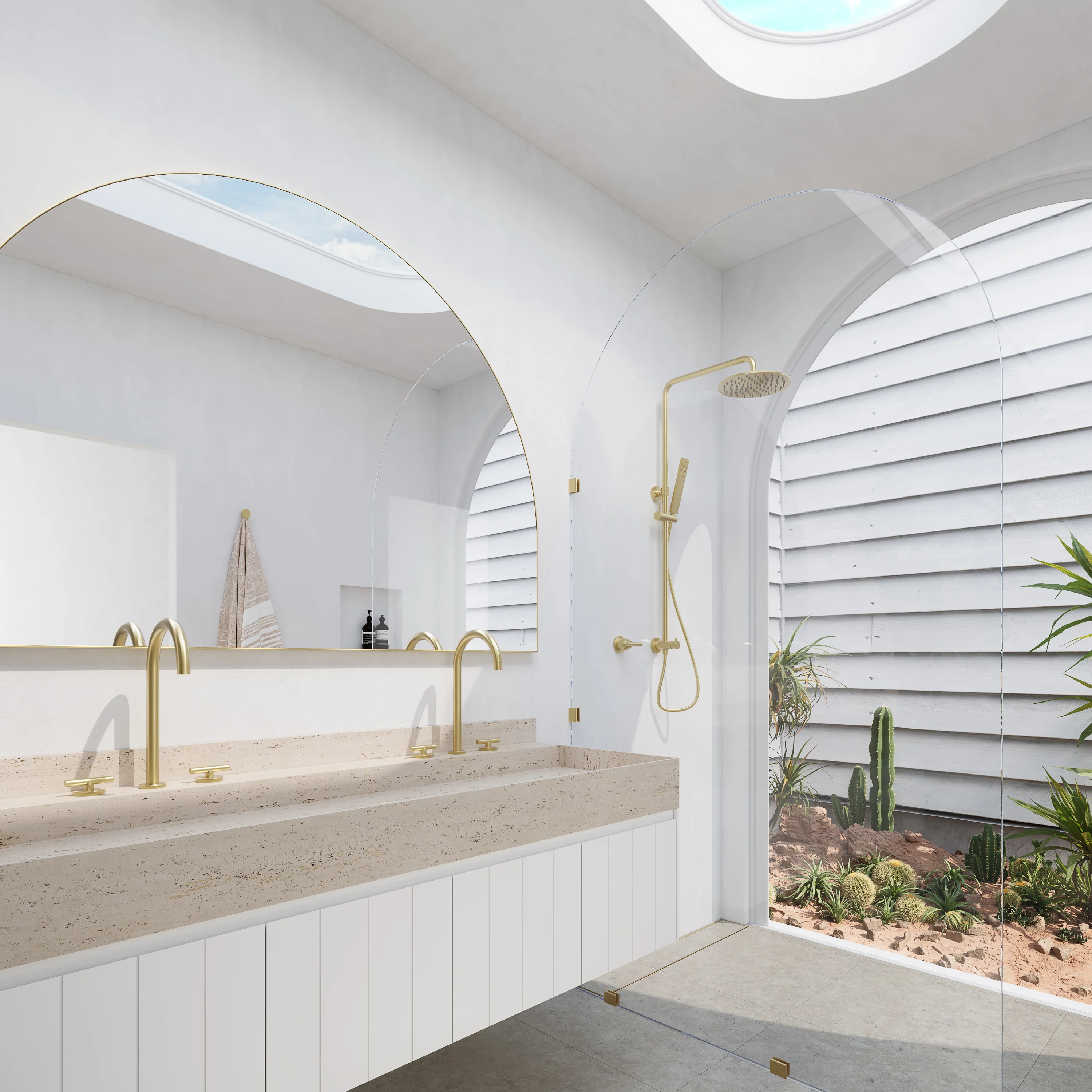
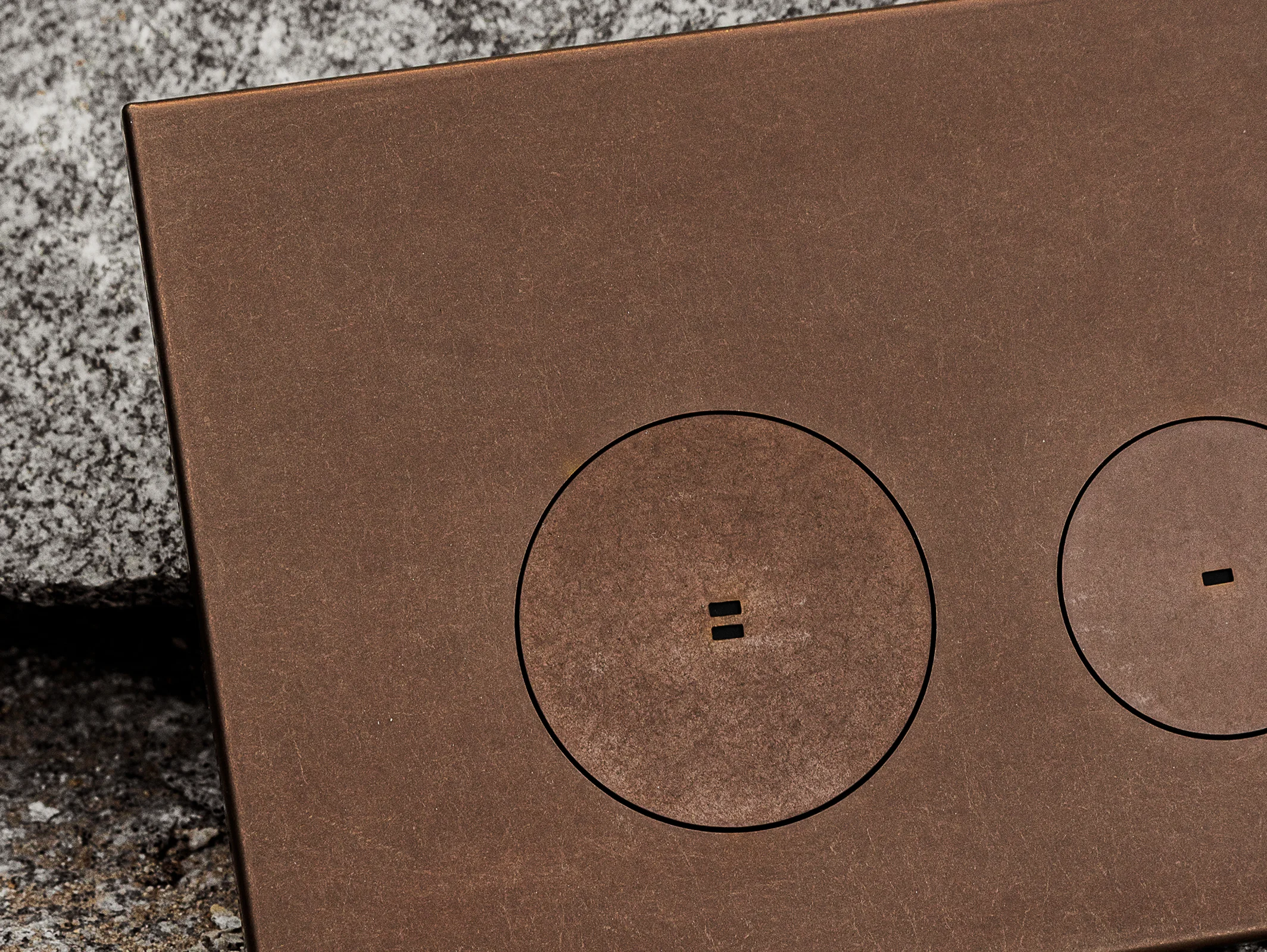
Our Range
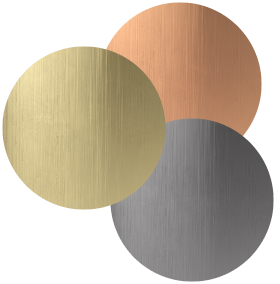


Interior Decoration Colour Combinations to Try in 2026
It’s already clear that 2026 is a year of experimentation and expression in interiors. As all-white schemes step aside, these interior decoration colour combinations embrace character and creativity, less about chasing a timeless look, and more about cultivating an enduring feel.
From the deep, atmospheric richness of plum to the soft, comforting warmth of butter yellow, these combos bring a subtle edge to your space. Expressive yet grounded, each explores colour’s ability to evoke mood, memory, and emotion.
Whether through gentle tonal pairings or confident contrasts, these interior design colour palettes invite you to introduce a hint or a bold injection of colour into your home.
Interior decoration colour combinations don’t have to dominate a space to make an impact. Whether achieved with furniture, a rug, or décor, these thoughtful pairings bring colour into the home in a way that feels balanced, curated, and quietly confident.
Plum Noir and Cool Blue
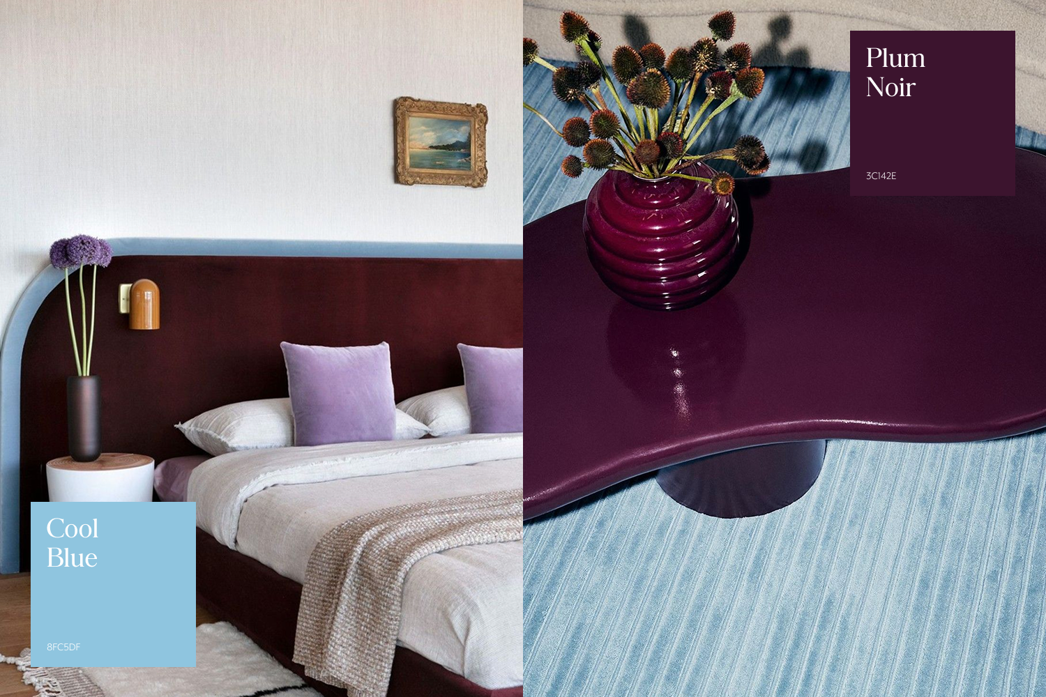
Taking cues from the 2026 Pinterest Palette, cool blue was crowned colour of the year. With this in mind, we can expect a wave of thoughtful pairings designed to elevate this dreamy hue.
When partnered with plum noir, another Pinterest Palette leader, cool blue gains a sense of decadence and depth. The contrast between rich and soft tones creates a playful yet balanced aesthetic.
An adventurous colour tempered by a calming counterpart, this interior decoration colour combination lends itself to every space in the home. Introduced through tiles, textiles, or decorative accents, it can be layered subtly or embraced fully for a bold take on one of 2026’s leading combinations.
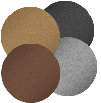
Cobalt Blue and Soft Rust
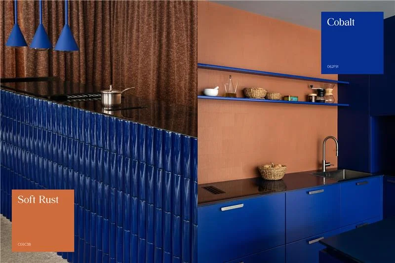
Audacious as cobalt blue may be, it delivers a richness and intensity unlike any other colour. When paired with the warmth of rust, the result is a cool-meets-warm combination that shapes a distinctly expressive atmosphere.
Bold, bright, and optimistic, this interior design colour combination brings an undeniable sense of fun and personality, transforming even the most tired zone into a contemporary corner with a bespoke feel.
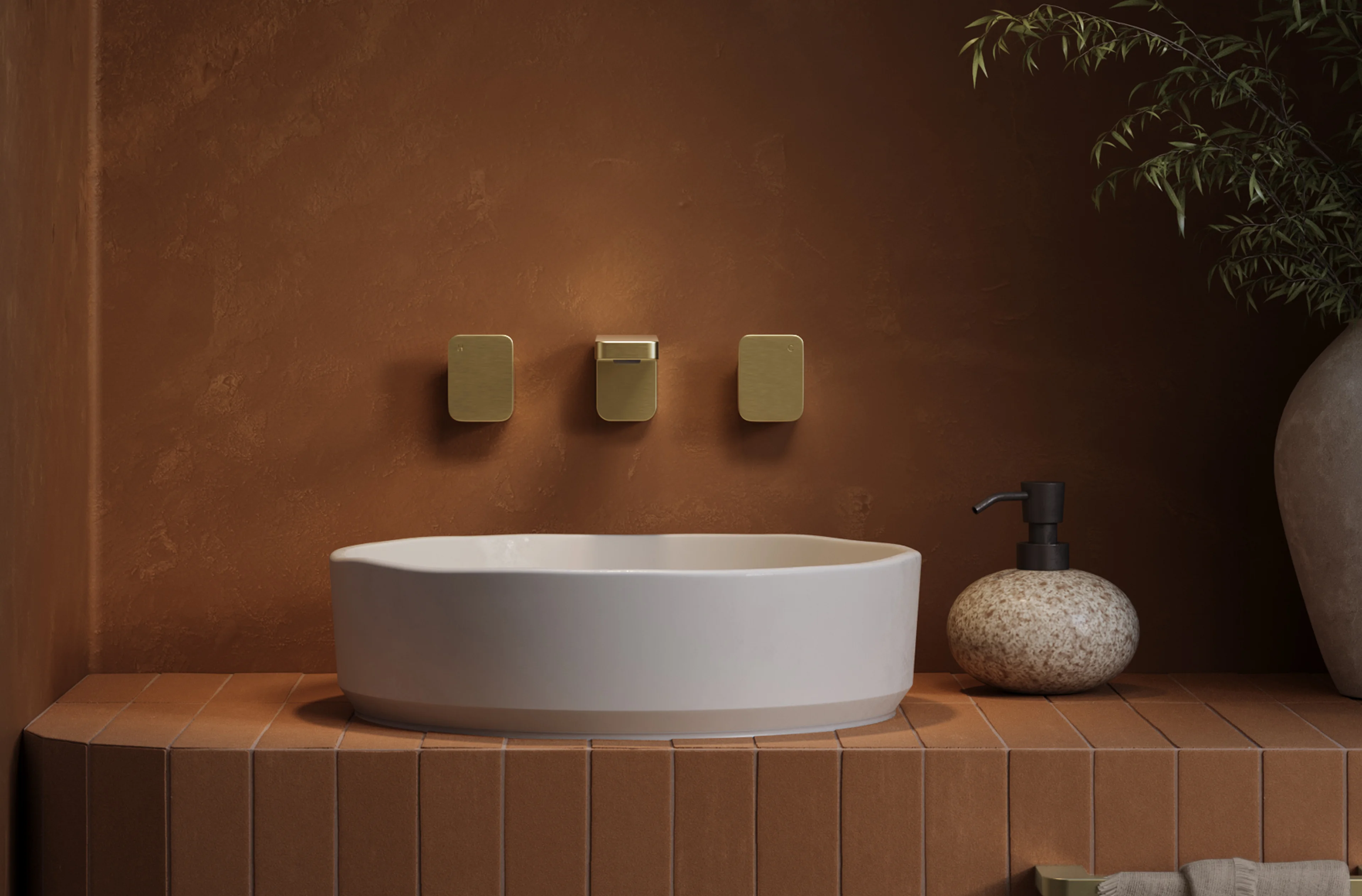
Rustic Red and Brushed Copper
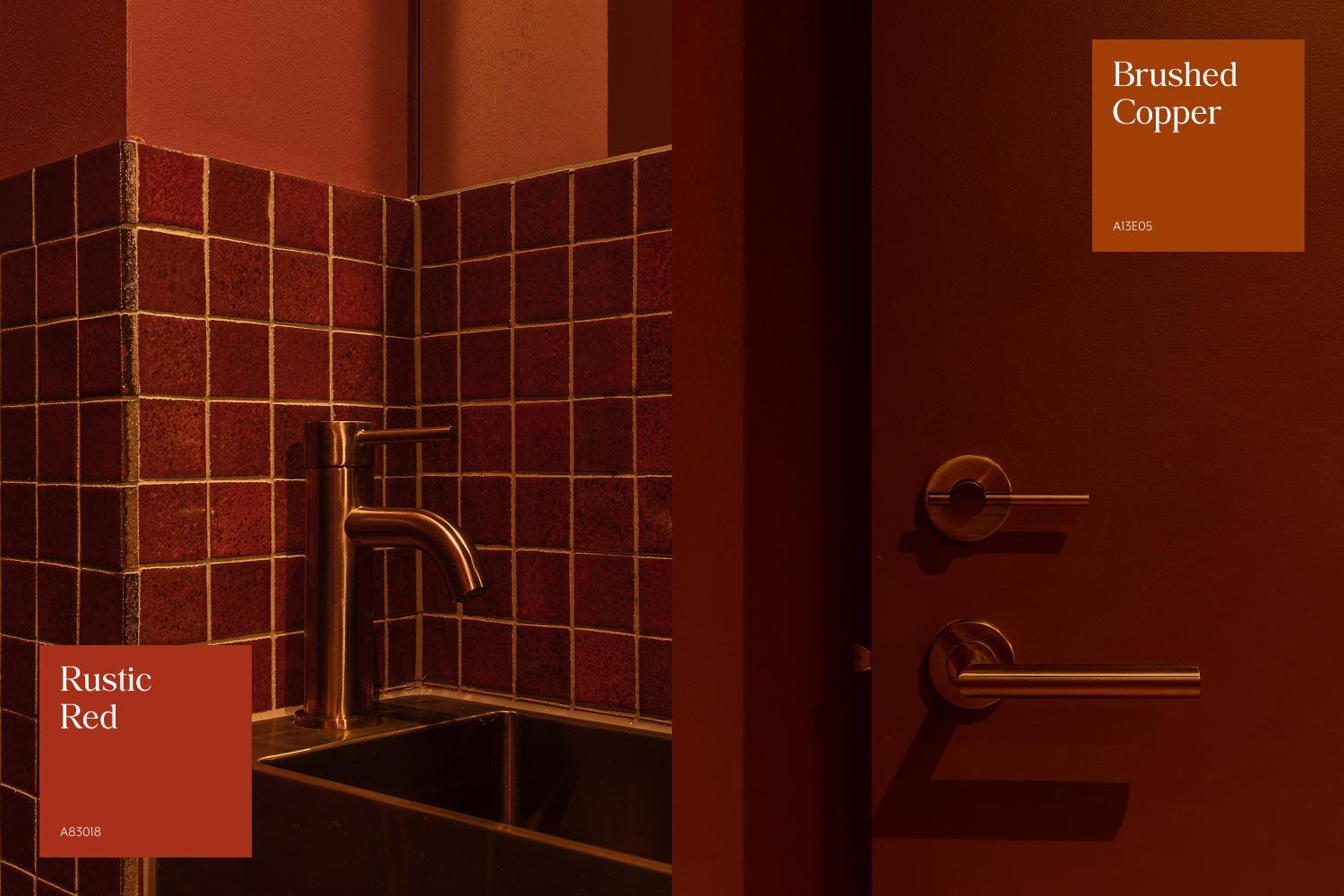
A colour combination you might initially question, but will undoubtedly love, is the layering of rich, warm tones.
Copper and red form a harmonious pairing: one deep and dark, the other bright and metallic. Together, this blend of reds and coppers creates atmosphere and mood, wrapping a space in a sense of luxury, romance, and quiet mystery.
Seen here, brushed copper is paired with the deep red of our Miyako Handmade Mosaic Tile, two distinct hues connected by their warm undertone.
Smokey Blue and Cocoa
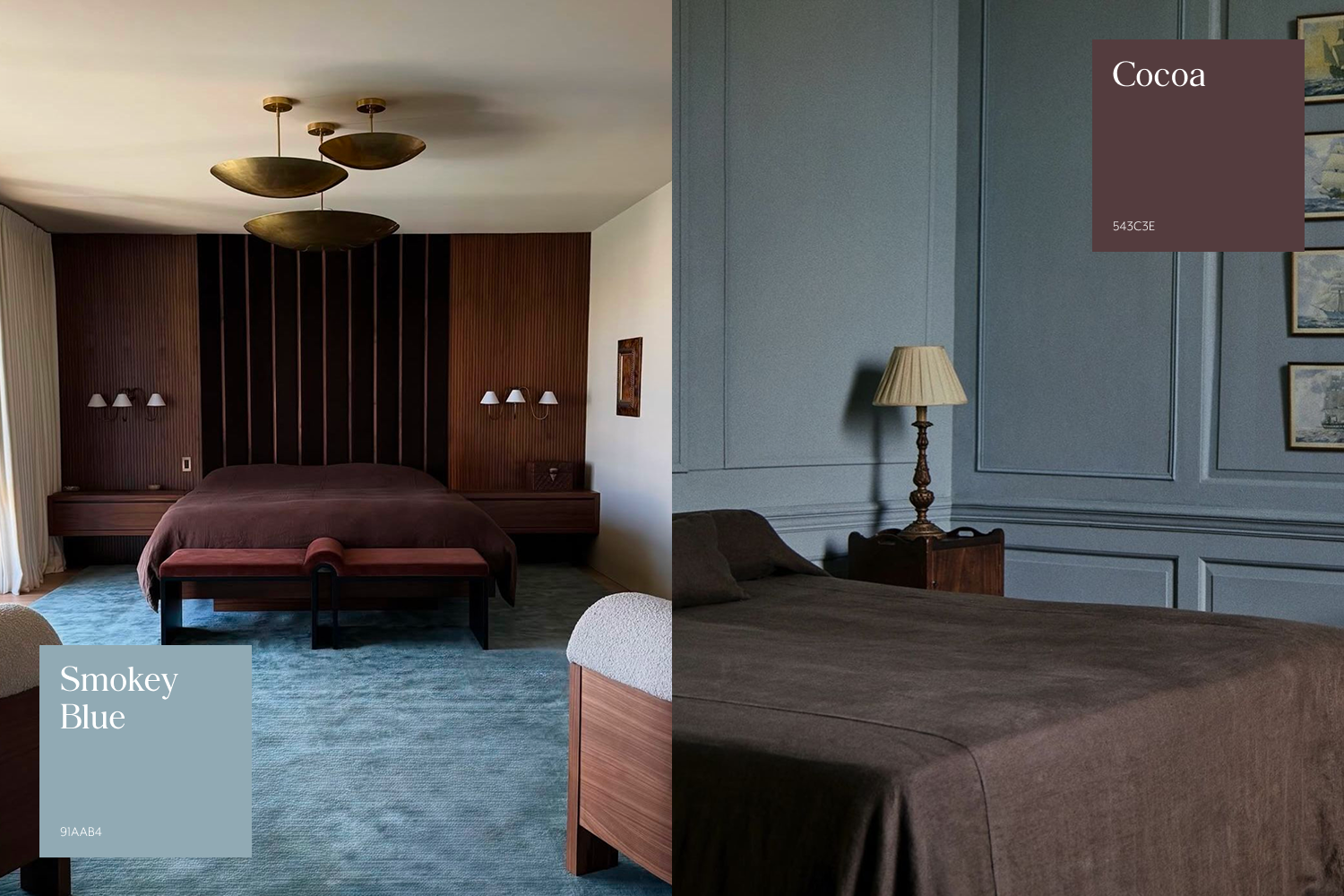
While interior design colour combinations are designed to spark feeling and fun, experimenting with colour should still feel achievable and true to your personal style.
This is where more understated pairings come into play. From smokey blue’s silky softness to the deep comfort of cocoa, this combination feels right at home in living rooms and bedrooms, creating a relaxed, calming harmony.
Achieve it with dark timber joinery, textured linens, or a blue coat of paint, creating a base for accent colours to pop.
Buttermilk and Light Grey
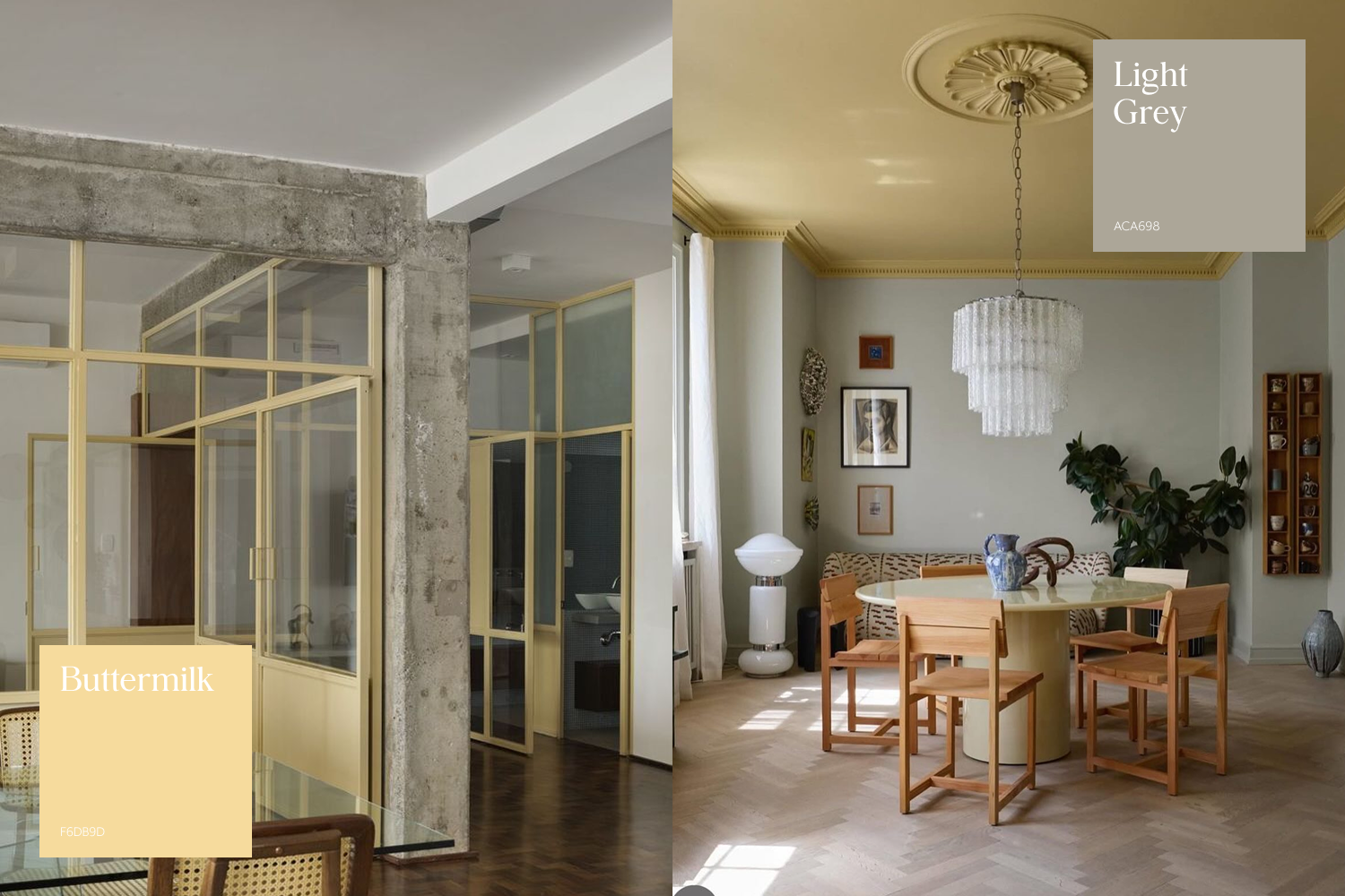
Although the era of all-grey interiors may be behind us, the shade still holds enormous design potential, particularly when paired with tones that soften and modernise its tone.
From concrete and other smooth stone surfaces to metallic interpretations such as brushed nickel, chrome, and stainless steel, soft silver and grey pairings remain firmly in style.
Introduce yellow to bring warmth, character, and a playful calm. Its transformative quality is undeniable, making it an ideal choice for lifting darker schemes or brightening brutalist-inspired spaces.
Olive Green and Plum
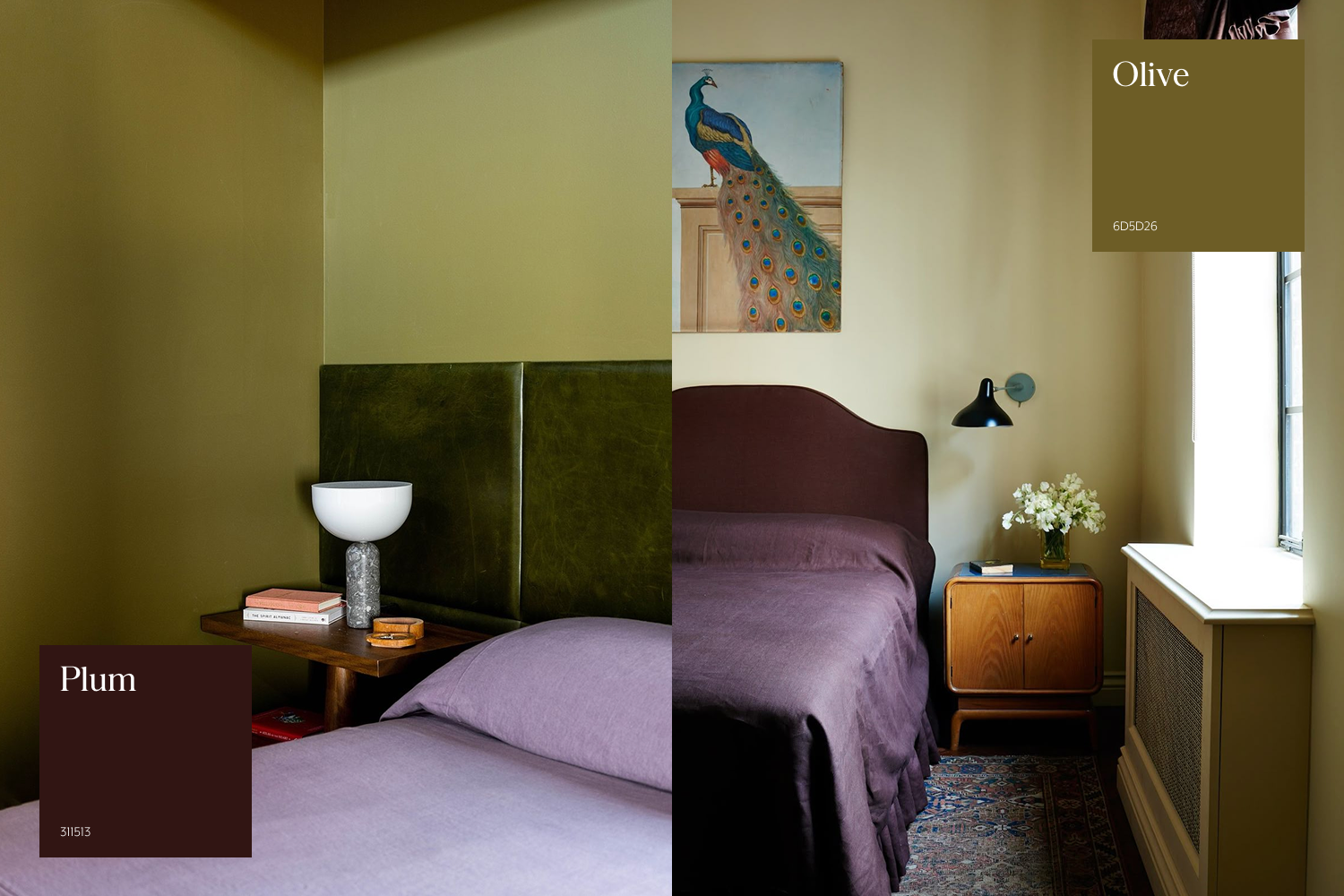
Brave yet undeniably beautiful, the colour palette interior design pairing of olive green and plum evokes a sense of opulence and mood. Both hues are rich and expressive, yet distinct in their character.
Introduce them with small accents to test the balance together; this combination delivers a bold contrast with an earthy edge.
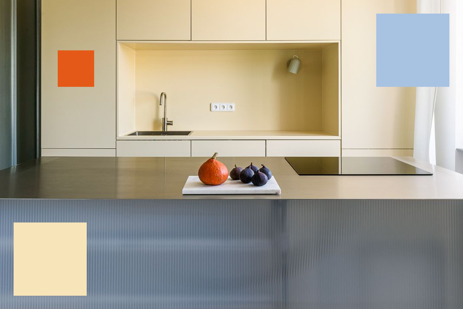
Terracotta and Lemon Yellow
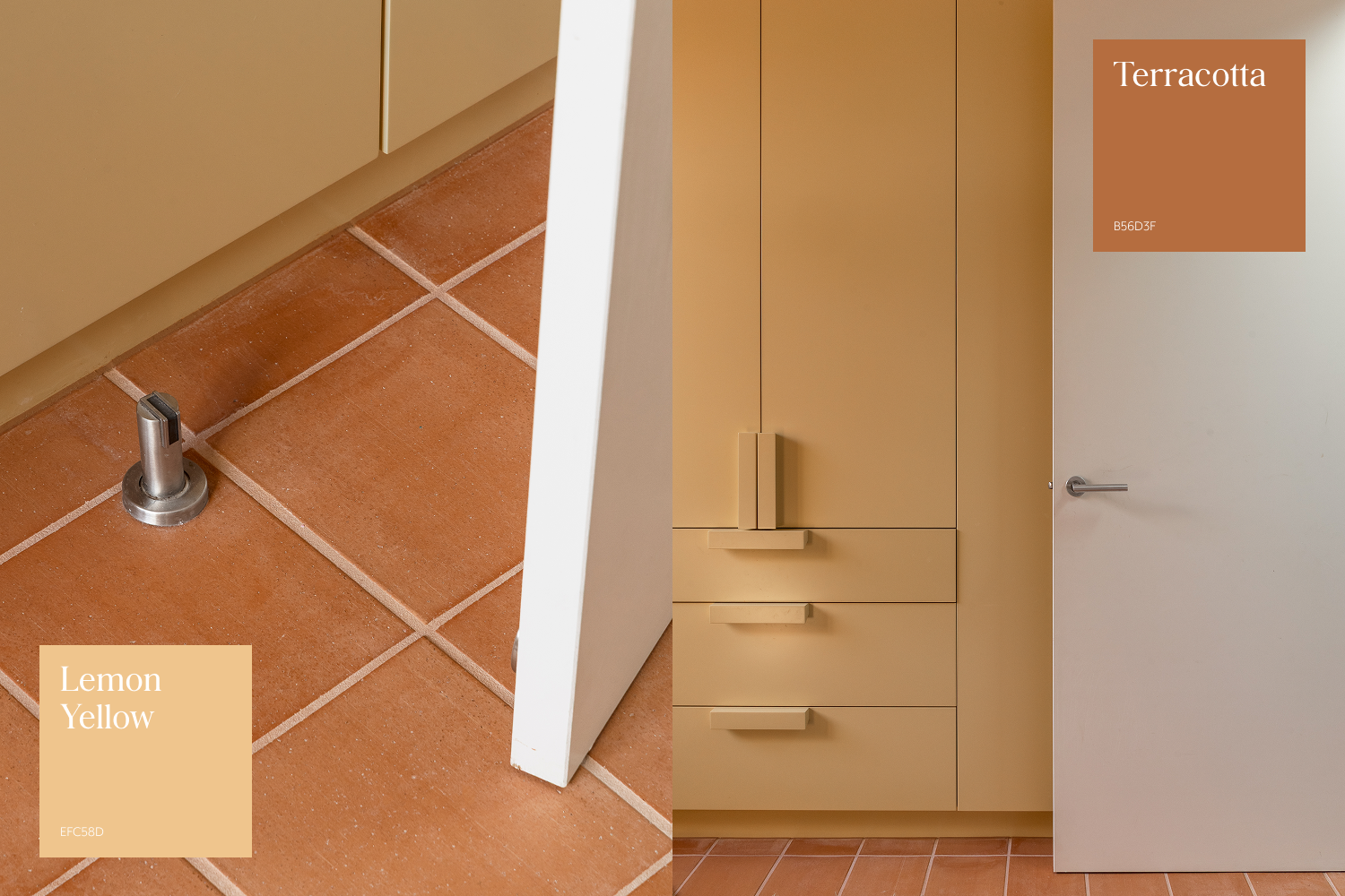
Grounding yet bright, terracotta and lemon yellow form an interior decoration colour combination that works across rich textures and smooth, glossy finishes alike.
Long favoured for decorative touches, terracotta evokes the warmth and handcrafted charm of the Tuscan style. This duo can also be seen as an earthier interpretation of Pinterest’s 2026 colour prediction, persimmon. Together, the combination infuses spaces with character and warmth, while offering a playful, uplifting palette perfect for children’s rooms and beyond.
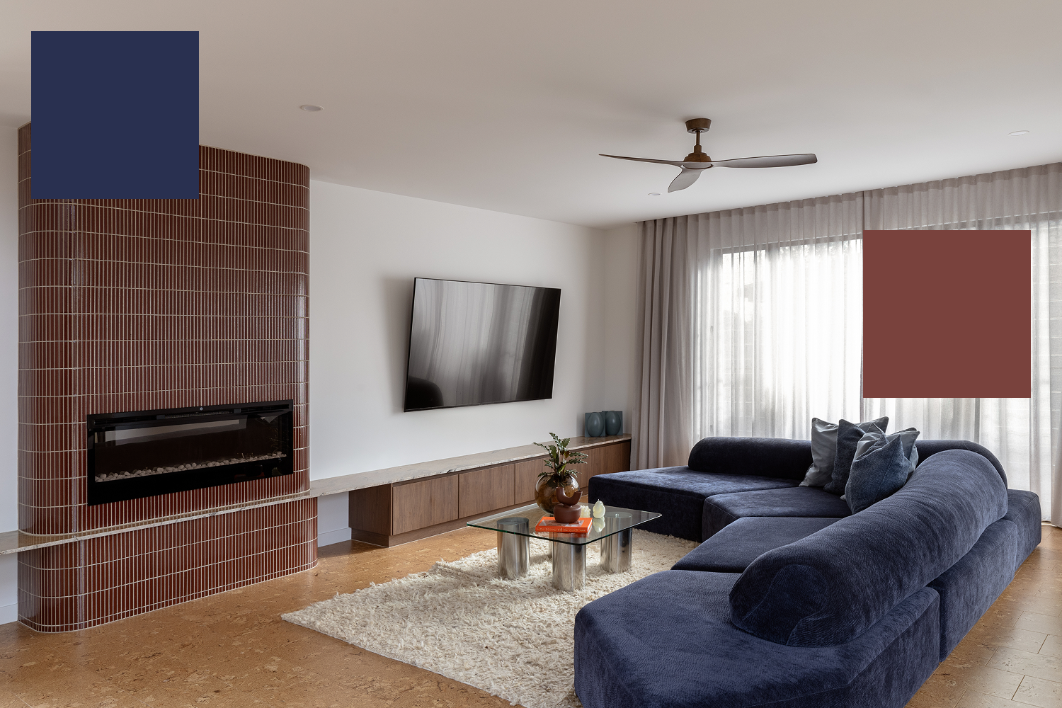
Teal and Burgundy
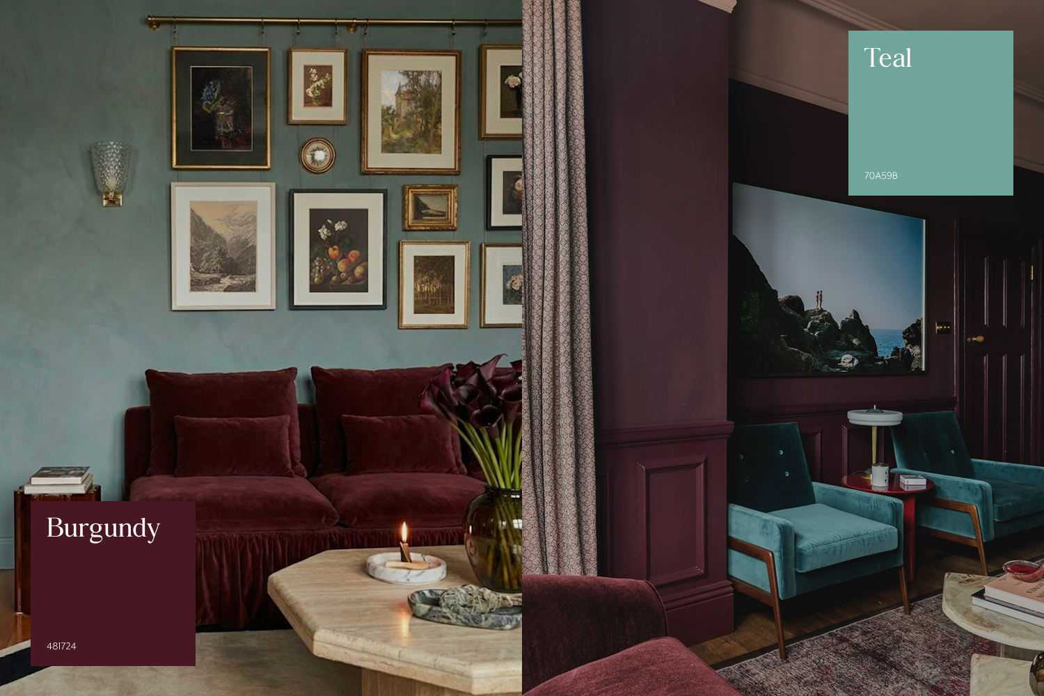
Sophisticated yet stylish, teal and burgundy create a rich, harmonious pairing that is beautifully complemented by creams and beige tones.
Introduce this interior decoration colour combination through natural stone tiles, plush textiles, or statement lighting to evoke an elegant, luxurious atmosphere.
Maple and Brushed Gunmetal
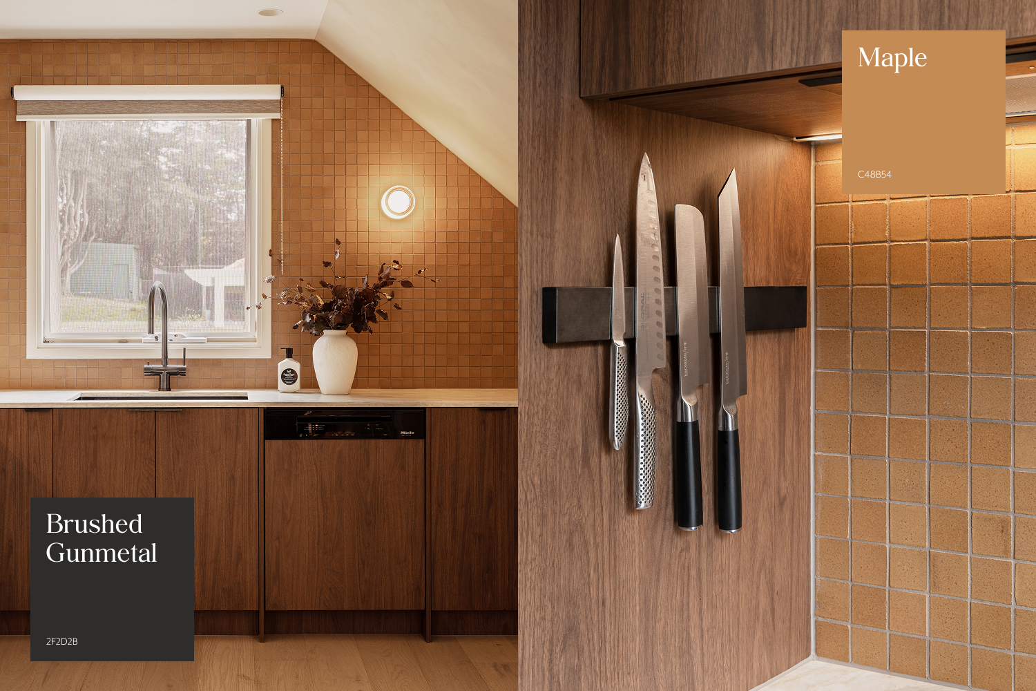
A contemporary colour combination that evokes a cosy, country-inspired feel, soft maple hues paired with a cool metallic brushed gunmetal strike the perfect balance between textured warmth and sleek refinement.
Offering character without overwhelming the space, this versatile pairing works beautifully in bathrooms, laundries, or kitchens alike.
Any muted burnt orange paired with a cool metallic finish can achieve this contrast. Complete the look with rich walnut timber elements for a lived-in, rustic feel.
Mauve and Wine
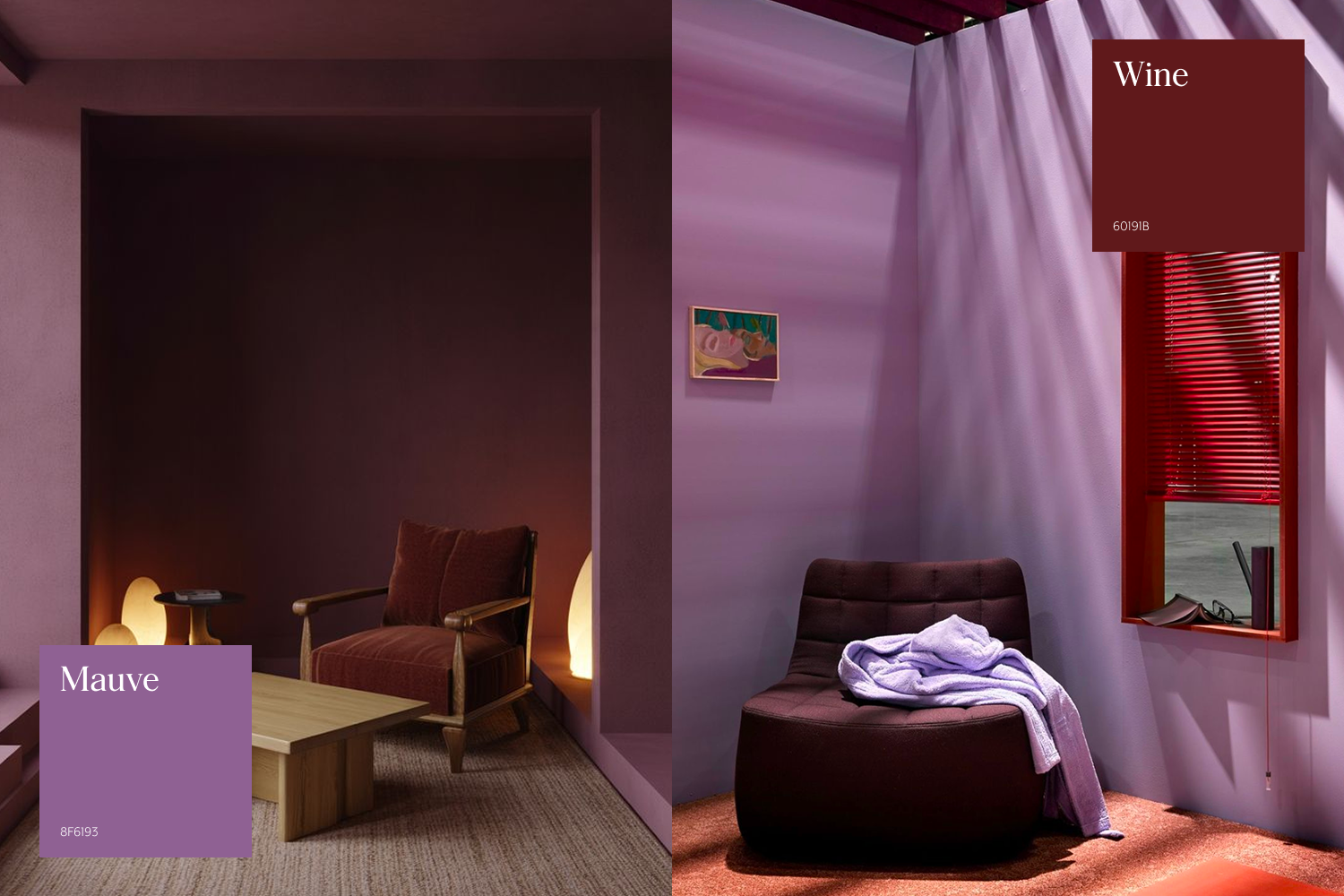
Mauve paired with wine offers a bold yet richly feminine energy. Whether introduced in a powder room or a primary suite, this combination balances the softness of pink and purple undertones with the depth and moodiness of deep red hues, creating a space that feels expressive yet refined.
When pairing two tones in an interior decoration colour combination, your selections should feel aligned with your personal style. Choosing shades you wouldn’t typically gravitate toward may feel exciting at first, but without a genuine connection, the result can lack longevity and quickly lose its appeal.
To achieve a harmonious result, your choices should reflect your own tastes, the style of your home, and your existing décor and furniture.
While following trends can capture the spirit of the moment, it doesn’t always ensure a timeless touch. Explore our range of coloured fixtures to bring your favourite combinations to life in your own space; shop in-store or online today.
Inspired by these ideas? Discover more interior ideas here:
Interior Design Trends to Watch in 2026
Understanding Interior Architecture
Using Flowers to Decorate: Simple Styling Ideas for Every Space