Our Range
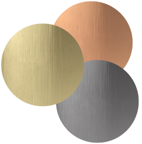


Interior Design Trends to Watch in 2026
The design landscape is shifting again. After a year defined by warm minimalism, earthy tones, and a rising desire for calm, 2025 interior design trends marked a move away from restraint toward interiors brimming with bold personality, resilience, and a focus on self-care.
Homes became more expressive and intentional, reflecting a collective desire for comfort, presence, and spaces that genuinely support wellbeing.
As we look ahead to 2026, that evolution feels even more purposeful. Craftsmanship, layered textures, and meaningful materials are on the rise, nostalgia is being reclaimed, and trends are being filtered through personal expression rather than strict rules. Most of what’s emerging isn’t new — it’s a rediscovery of design principles that were lost or overlooked over the past decade, updated for modern life.
Before diving into the year ahead, let’s take a moment to reflect on the trends that shaped 2025 and set the stage for what’s next.
Recap of the Top Interior Design Trends 2025
Organic Modernism
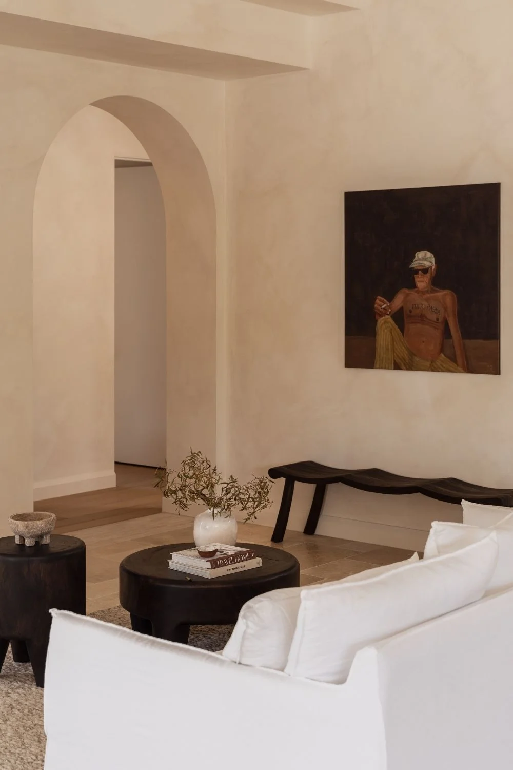
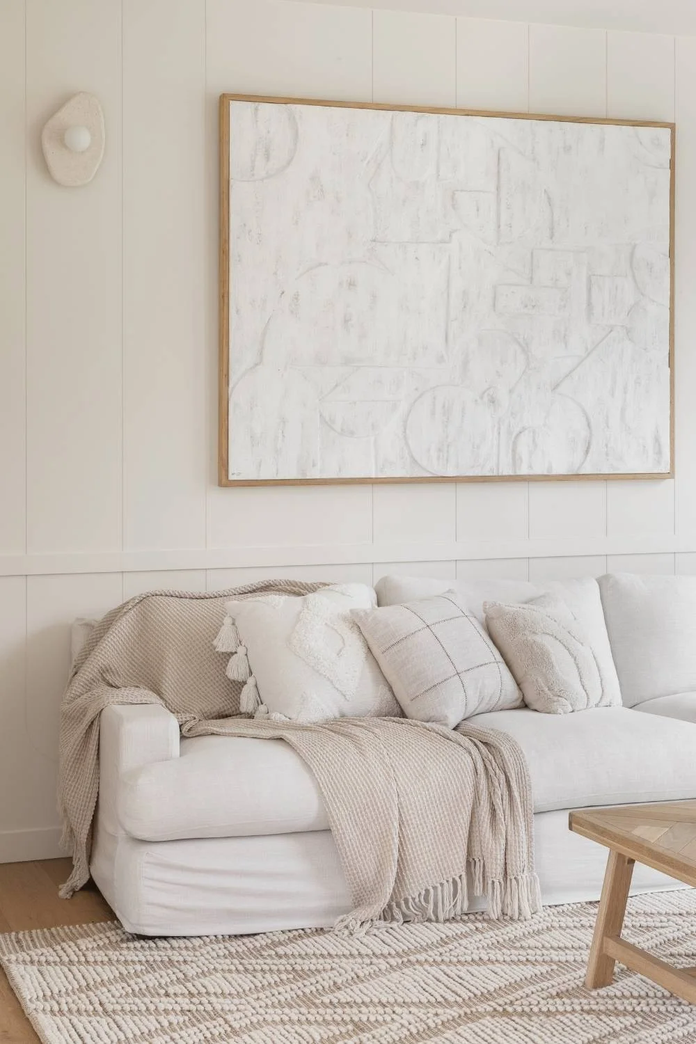
Over the past few years, we’ve gradually shifted away from stark minimalism toward organic modernism: a calming blend of warm neutrals, natural textures, and curated imperfection that creates truly lived-in spaces. This style prioritises emotional comfort, with uncluttered yet inviting rooms, cosy palettes, and gentle tactility.
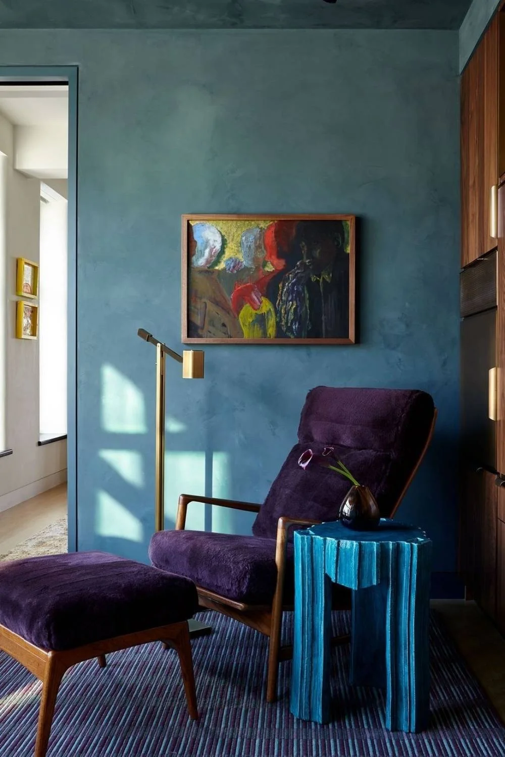
Colour Drenching
One hue, everywhere. Saturated walls, ceilings, trims, and upholstery created immersive, mood-driven rooms. Expect this trend to remain strong moving into 2026, as people continue to explore richly layered colours and patterns, from bathrooms to bedrooms.
Sustainable Materials & Biophilic Design
Conscious design went mainstream as recycled metals, eco-certified timbers, and closed-loop manufacturing became the norm. The mantra “buy less, buy better” defined consumer behaviour, while natural stone, light timbers, greenery and open airflow brought the emotional ease of the outdoors in.
Smart Spaces
Subtle, integrated technology enhanced everyday functionality, from hidden lighting and smart mirrors to automated shading that blended seamlessly into interiors. Designers continue to leverage AI for spatial planning and custom furniture design, showing how intelligent design is reshaping what’s possible in modern interiors.

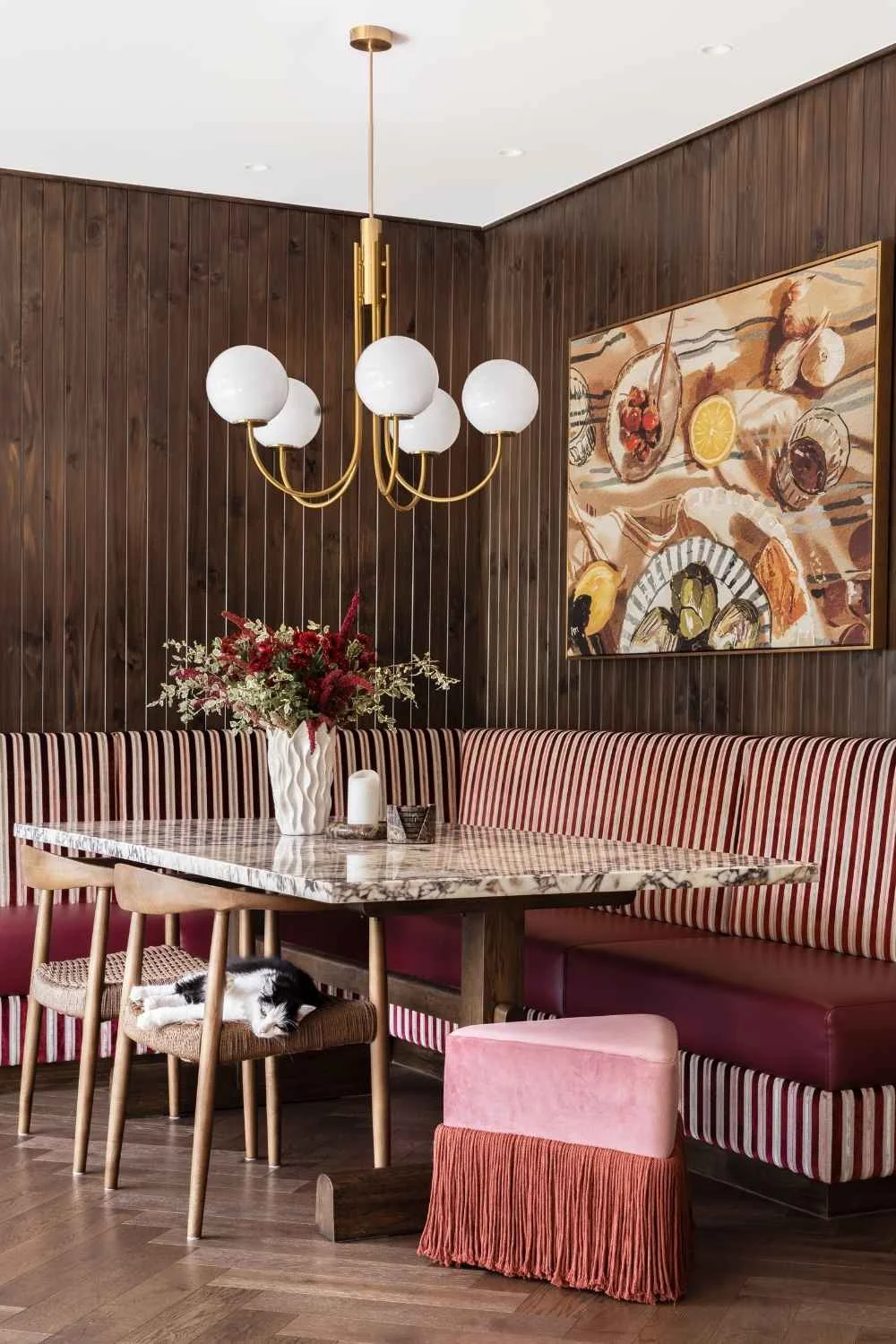
Sunken Lounges & Banquette Seating
Social spaces have been reimagined with informal, conversation-friendly layouts and cosy, built-in banquette seating that maximises comfort, connection, and flow. This trend reflects a broader shift toward unplugged meals, with homeowners intentionally creating spaces away from TVs and devices to foster presence, meaningful conversation, and shared moments.
Wellness at Home
Wellness moved beyond aesthetics, with homes designed to support nervous-system regulation through better acoustics, natural light, air quality, and tactile comfort. From spa-like bathrooms to small spaces for reading, meditation, or hot and cold rituals, wellness is becoming an integrated part of everyday living rather than an afterthought.
2025’s Top Trending Colours
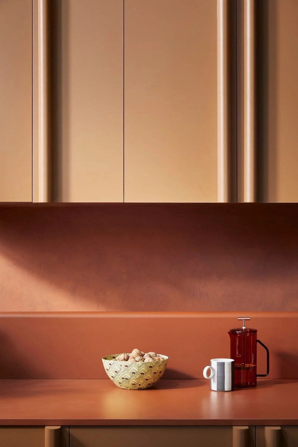
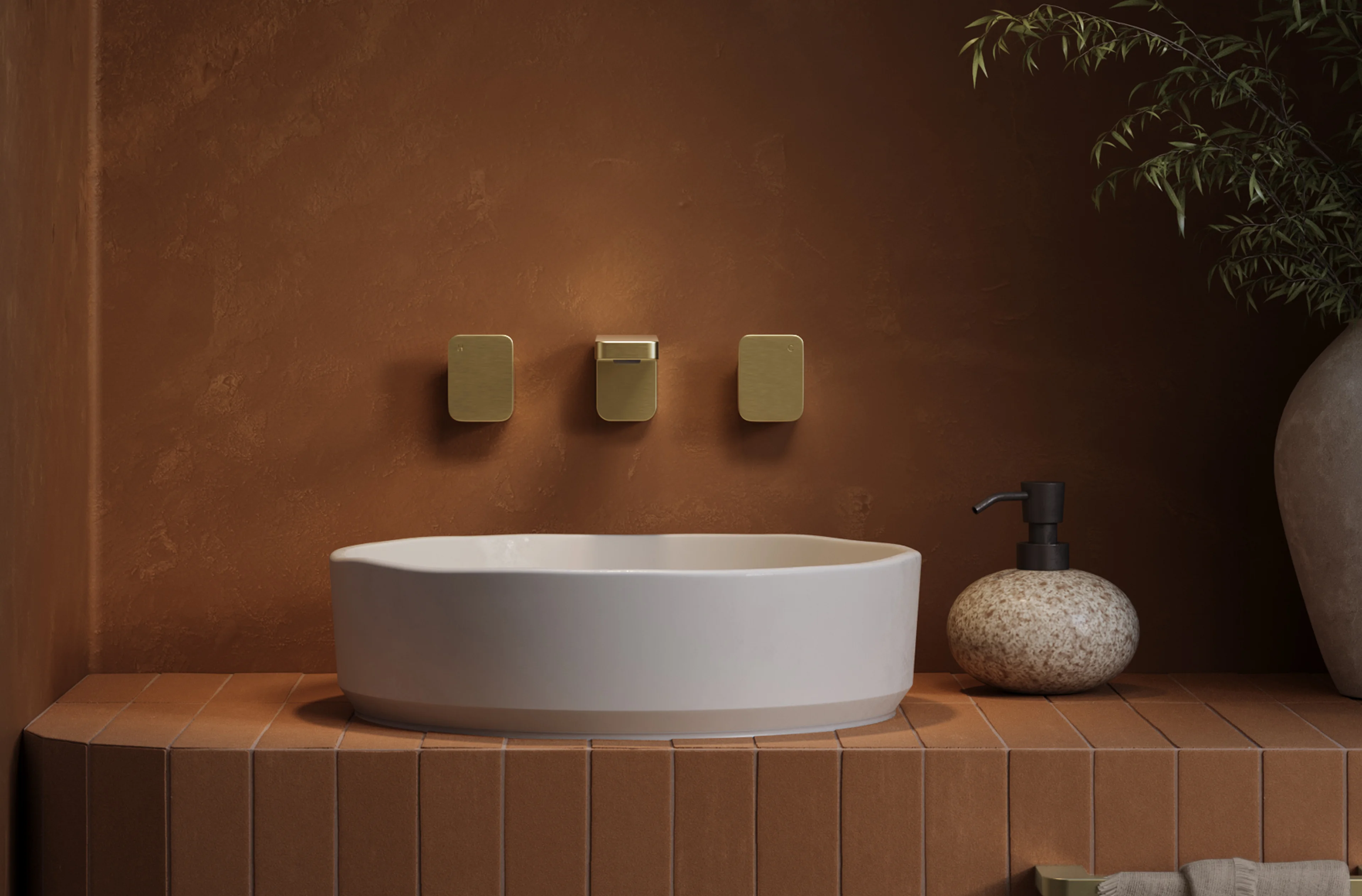
- Autumnal Hues: Rich, earthy tones like rust, ochre, and dark honey brought warmth and intimacy to living spaces, creating a cosy, grounded atmosphere.
- Cherry Reds: Vibrant and energetic, these bold reds added drama and personality, often used as statement walls, kitchen cabinetry, or accent furniture.
- Primary Colours: Playful pops of blue, yellow, and red were layered thoughtfully to inject joy and modernity, balancing colour intensity with restrained sophistication.
- Pantone Colour of the Year 2025, Mocha Mousse: A deep, comforting neutral reminiscent of chocolate and coffee, Mocha Mousse anchored interiors with understated elegance and a sense of cosy indulgence.
The Forecast: Interior Design Trends 2026
Pantone Colour of the Year 2026
Since its inception in 1999, the Pantone Colour of the Year has become more than a forecast; it’s a cultural marker and a major influence on current interior design trends worldwide. Each hue chosen by the Pantone Colour Institute reflects the collective mood, societal priorities and aesthetic shifts of its time, simultaneously influencing future design directions while capturing emerging trends.
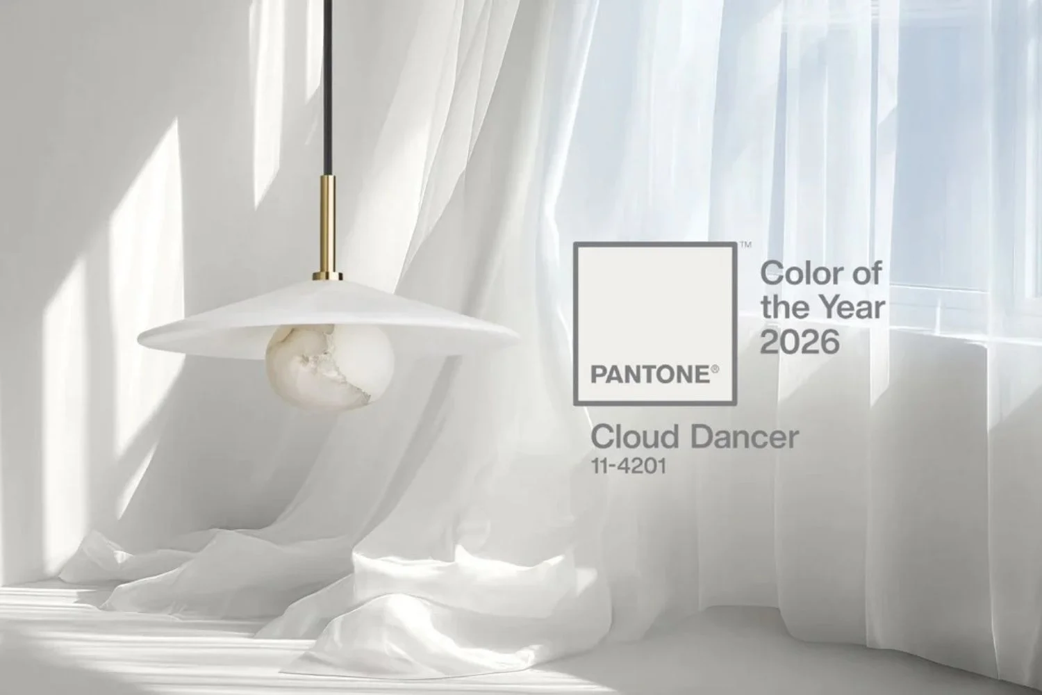
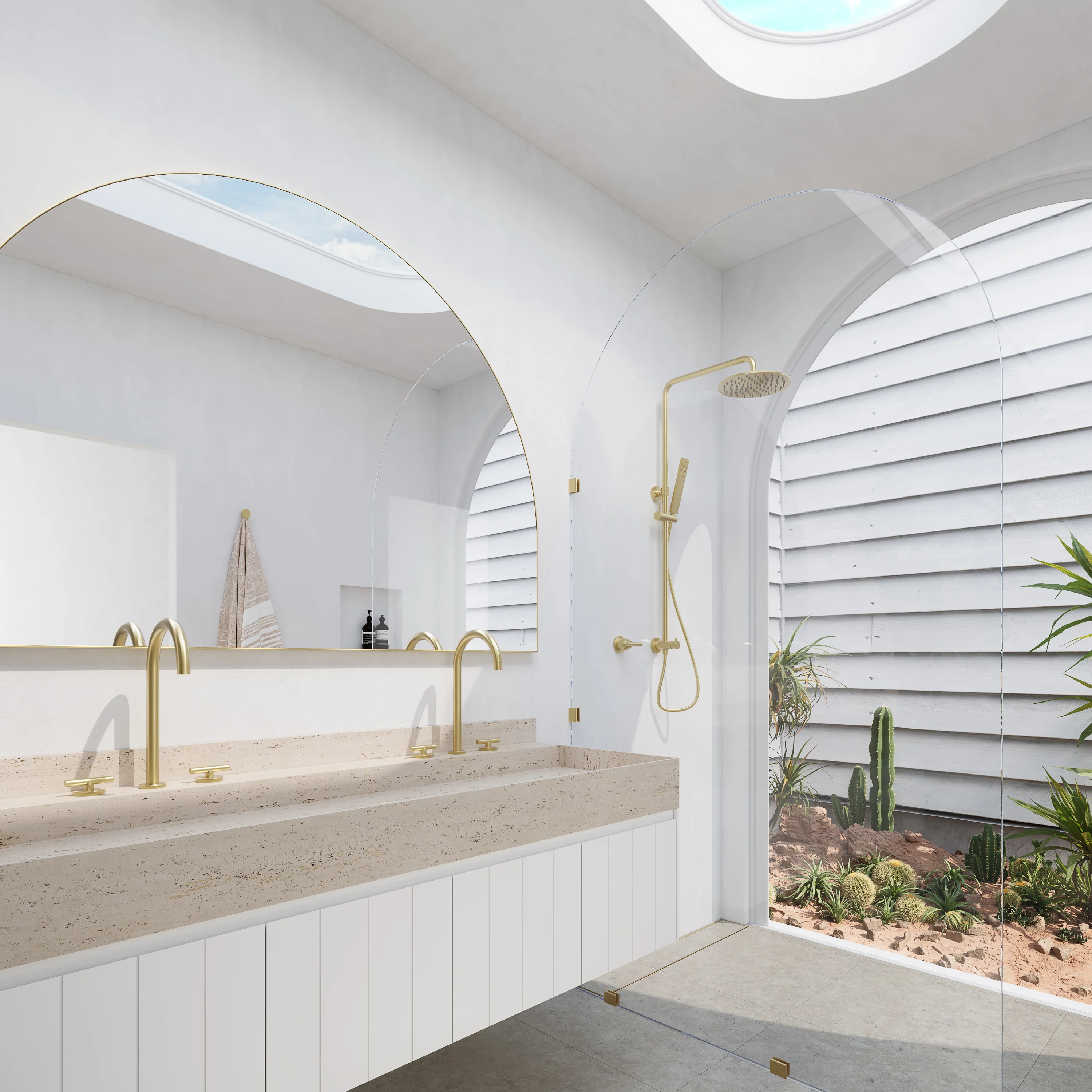
For 2026, Pantone has made an unexpected choice: a soft, airy white named Cloud Dancer. Described as a “billowy, balanced white,” the shade is intended to serve as a calming influence in what the institute calls a “frenetic society discovering the value of quiet reflection.”
This is the first time Pantone has declared a white, or off‑white, as its annual colour; a bold departure from the warmer or more saturated tones of recent years.
What makes Cloud Dancer so timely?
- It offers a clean‑slate moment, a visual reset amid a cluttered, fast-paced world.
- Its gentle warmth balances between cool and warm undertones, meaning it's less stark than a clinical white and more welcoming than a bright white.
- As Pantone suggests, Cloud Dancer embodies serenity, clarity and a return to basics, a kind of “breath of fresh air” for interiors feeling overwhelmed or overstimulated.
What this means for interiors in 2026:
- Expect more spaces to embrace white-toned backdrops, not just as minimalist statements, but as thoughtful canvases upon which colour, texture, and material can truly shine.
- Designers will likely lean into layering, combining Cloud Dancer walls or cabinetry with textural materials (such as tactile rugs, linen drapes, and brushed metal accents) to create warmth despite the light palette.
- It supports flexibility: Cloud Dancer pairs beautifully with soft pastels, earthy tones, deep blues, wood, and metallic accents — giving freedom to build interiors that feel both cohesive and personal.
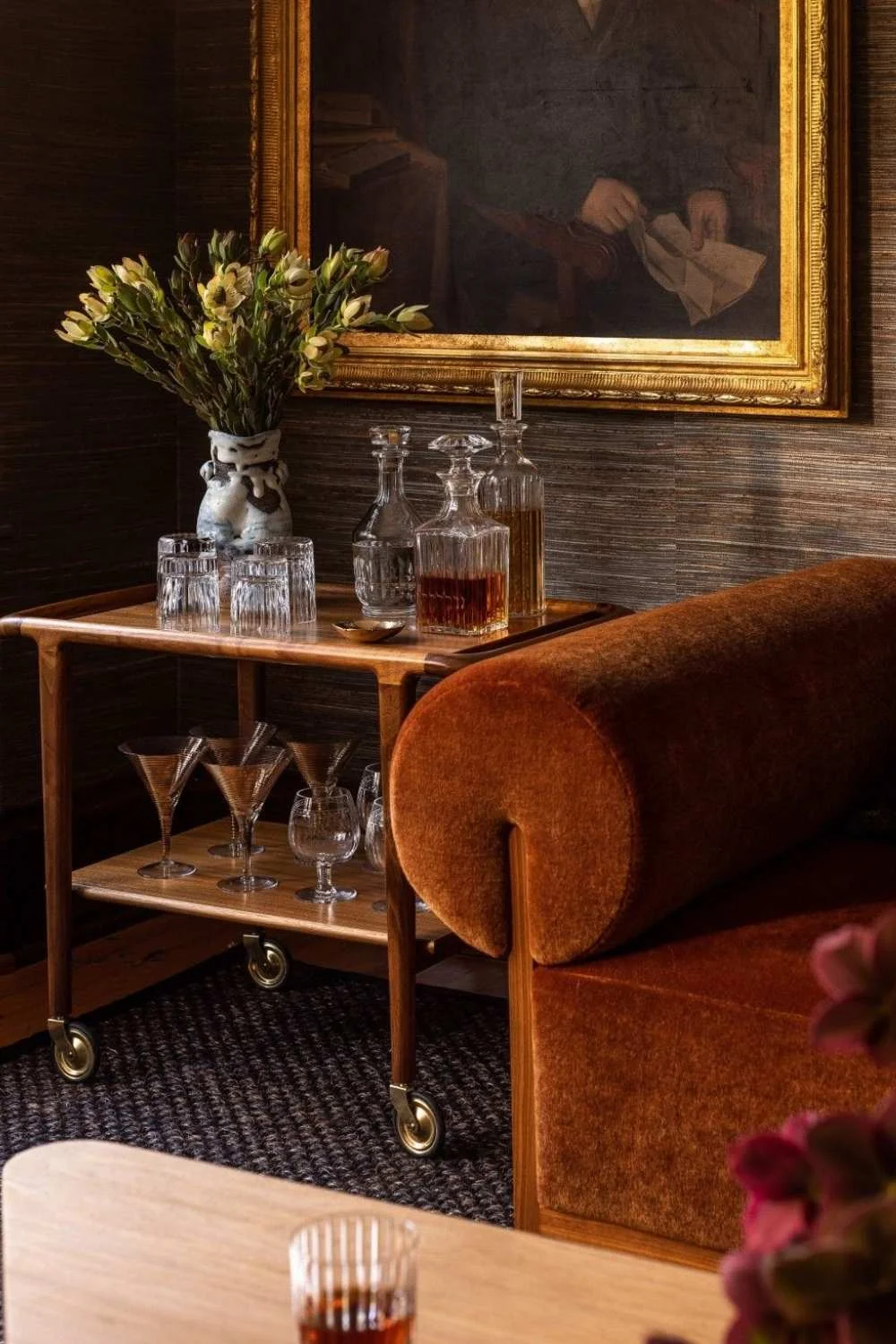
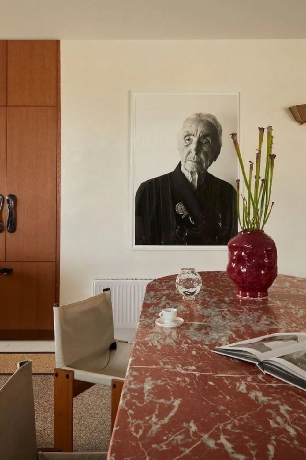
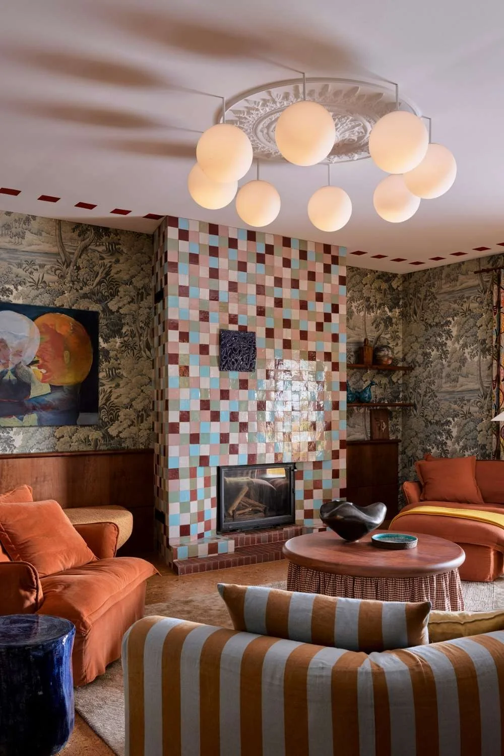
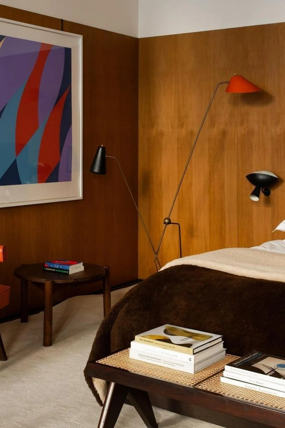
Nostalgic Reclamation
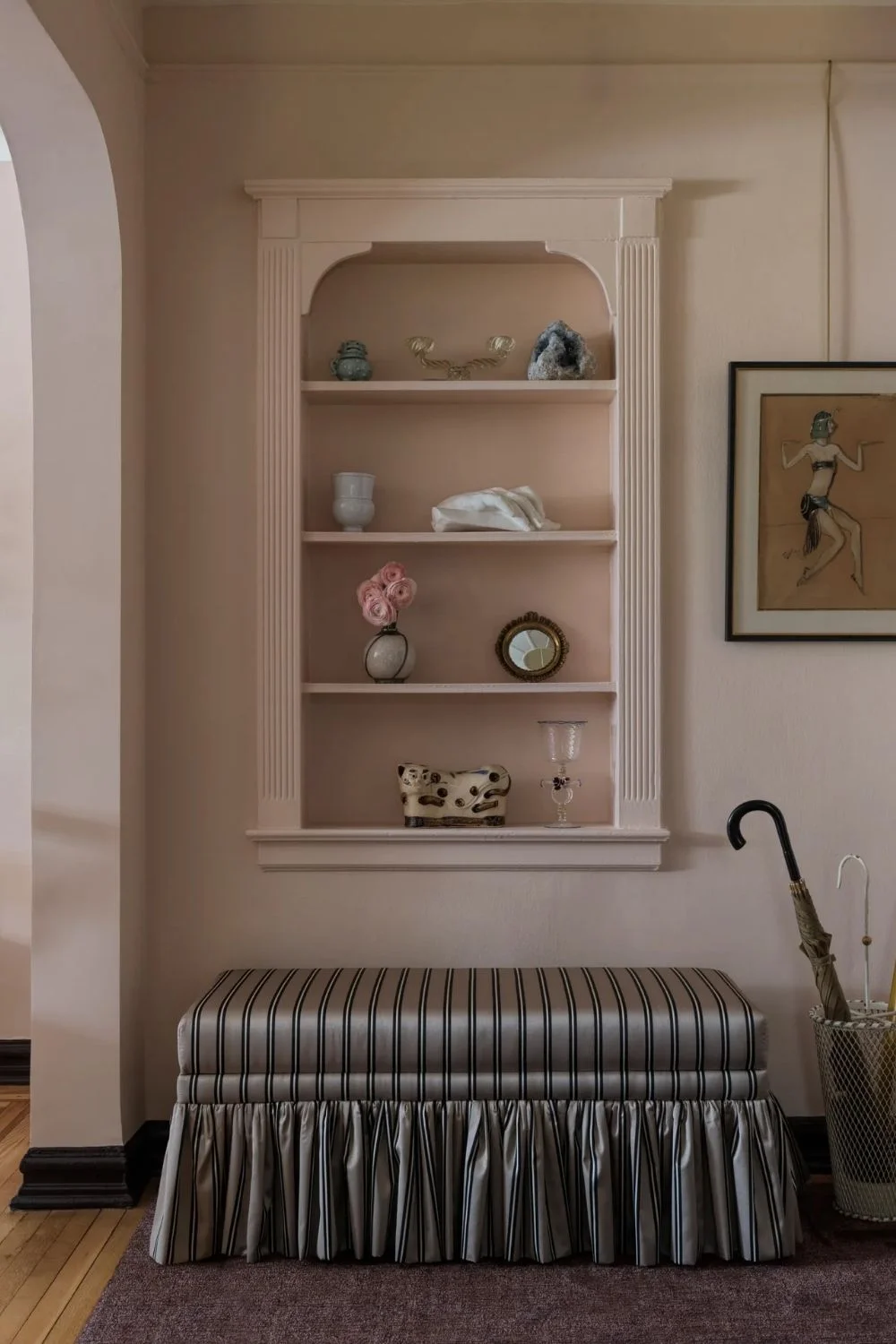
The interplay between old and new feels undeniably fresh, positioning it as one of the standout interior design trends for the year. Nostalgic reclamation blends heirlooms with contemporary shapes, rustic finishes with refined metals, and antique wood with sleek lighting. It’s less about vintage maximalism and more about interiors that feel personal, storied, and genuinely lived-in.
Pinterest has reported a steady rise in nostalgic trends that tap into childhood memories and emotional comfort. According to its latest Pinterest Predicts report, comfort has become consumers’ primary emotional anchor, with 55% of global respondents prioritising it in their daily lives. Rather than simply revisiting the past, nostalgia is evolving into reclamation — a thoughtful fusion of old and new that helps people feel grounded as they navigate an uncertain future.
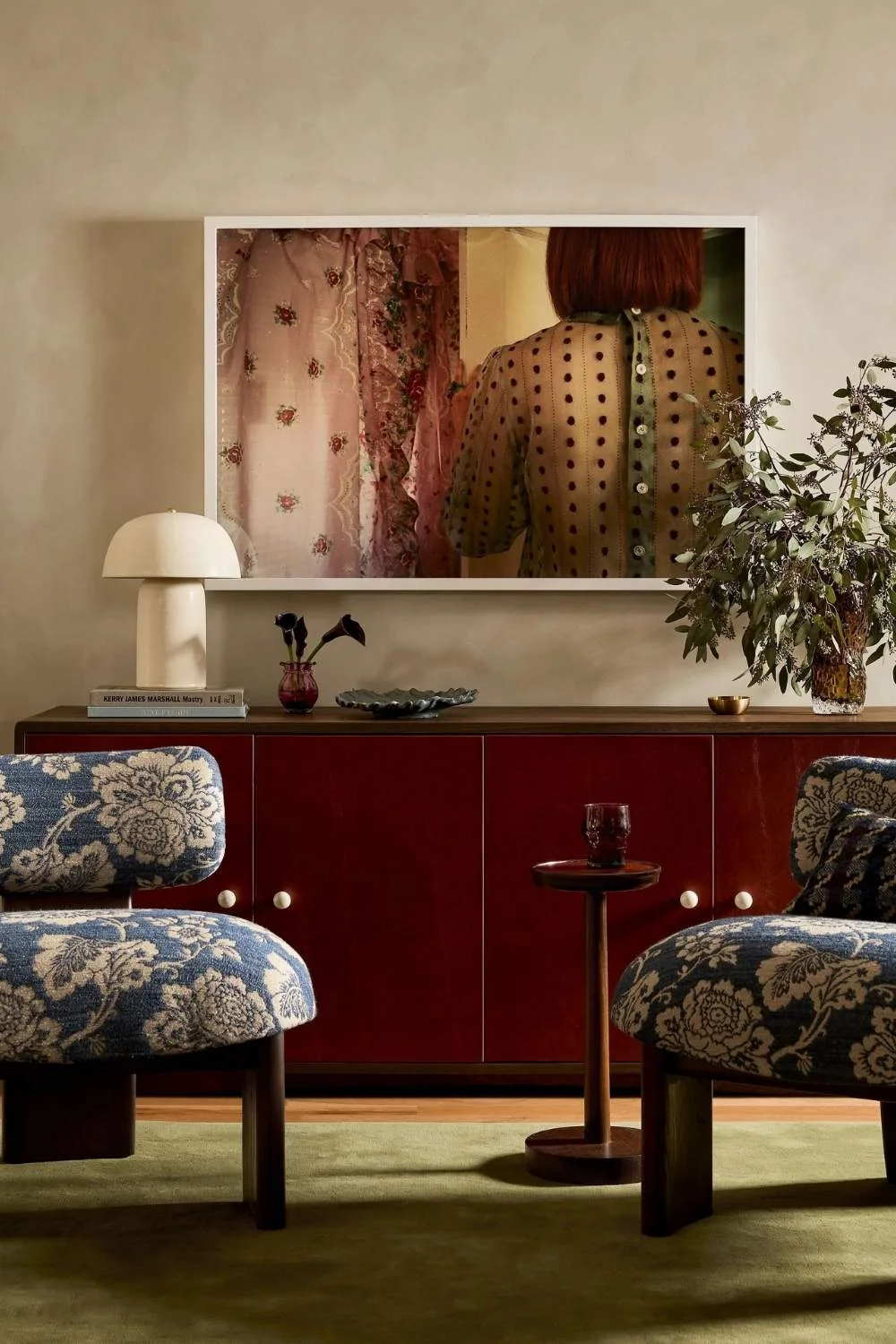
After years of heavy minimalism, homeowners are reintroducing retro elements with intention. Expect to see:
- Antique furniture paired with modern silhouettes, creating contrast and depth
- Vintage pendants illuminating contemporary artwork, where lighting becomes both functional and expressive
- Warm timbers layered with sculptural antique brass or bronze accents, adding richness and tactility
- Patterned rugs, textured cushions, and indulgent finishes like leather, marble, and velvet
- Curated nostalgia moments, from vintage books and ceramics to heirloom objects styled alongside modern décor
- Chunky 90s-inspired furniture pieces, scaled for modern living
- Glamorous Art Deco accents, from antique bar carts to leather banquettes
The result is a home that feels layered and soulful, where every piece carries meaning, and every space encourages comfort, creativity, and connection.
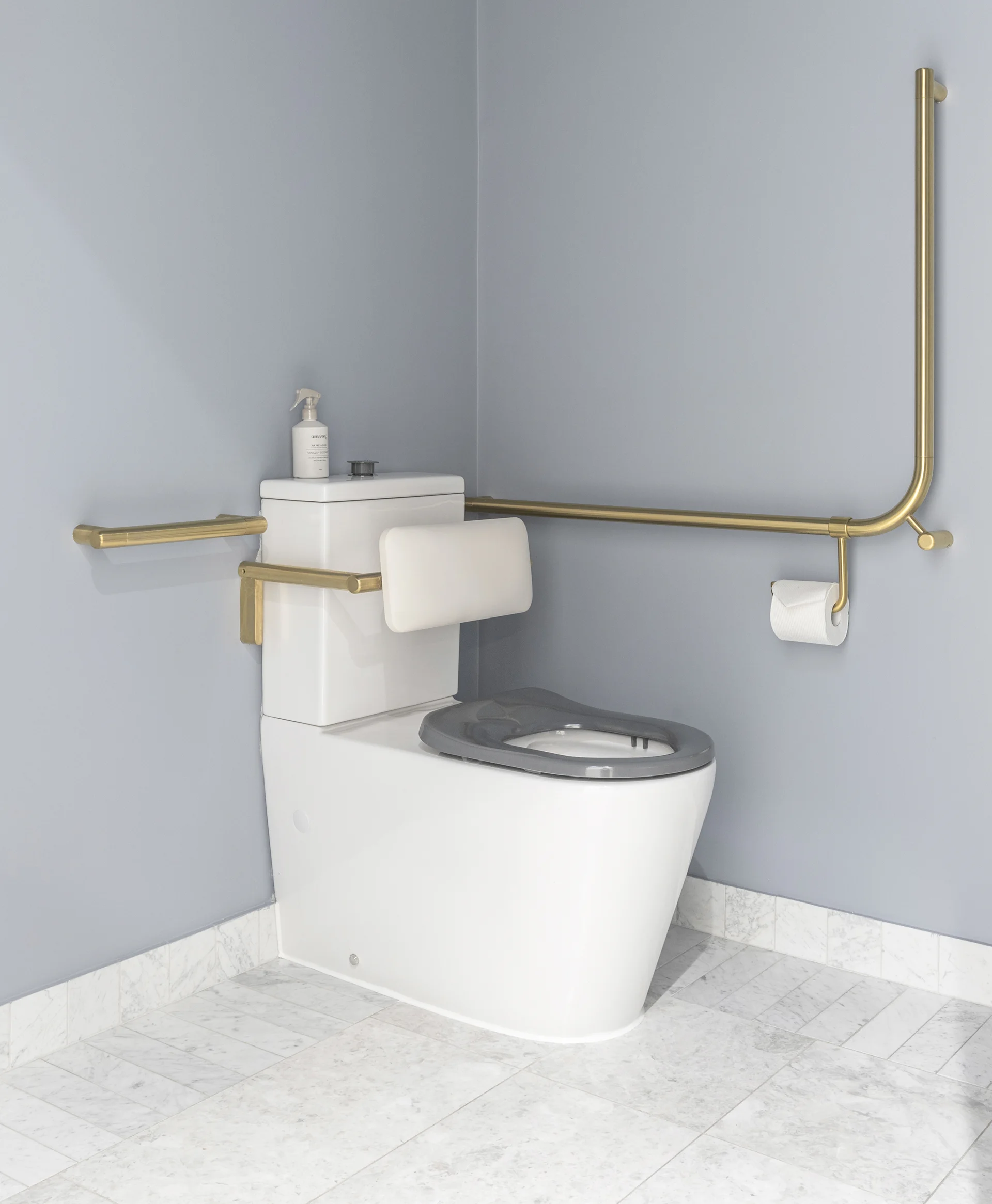
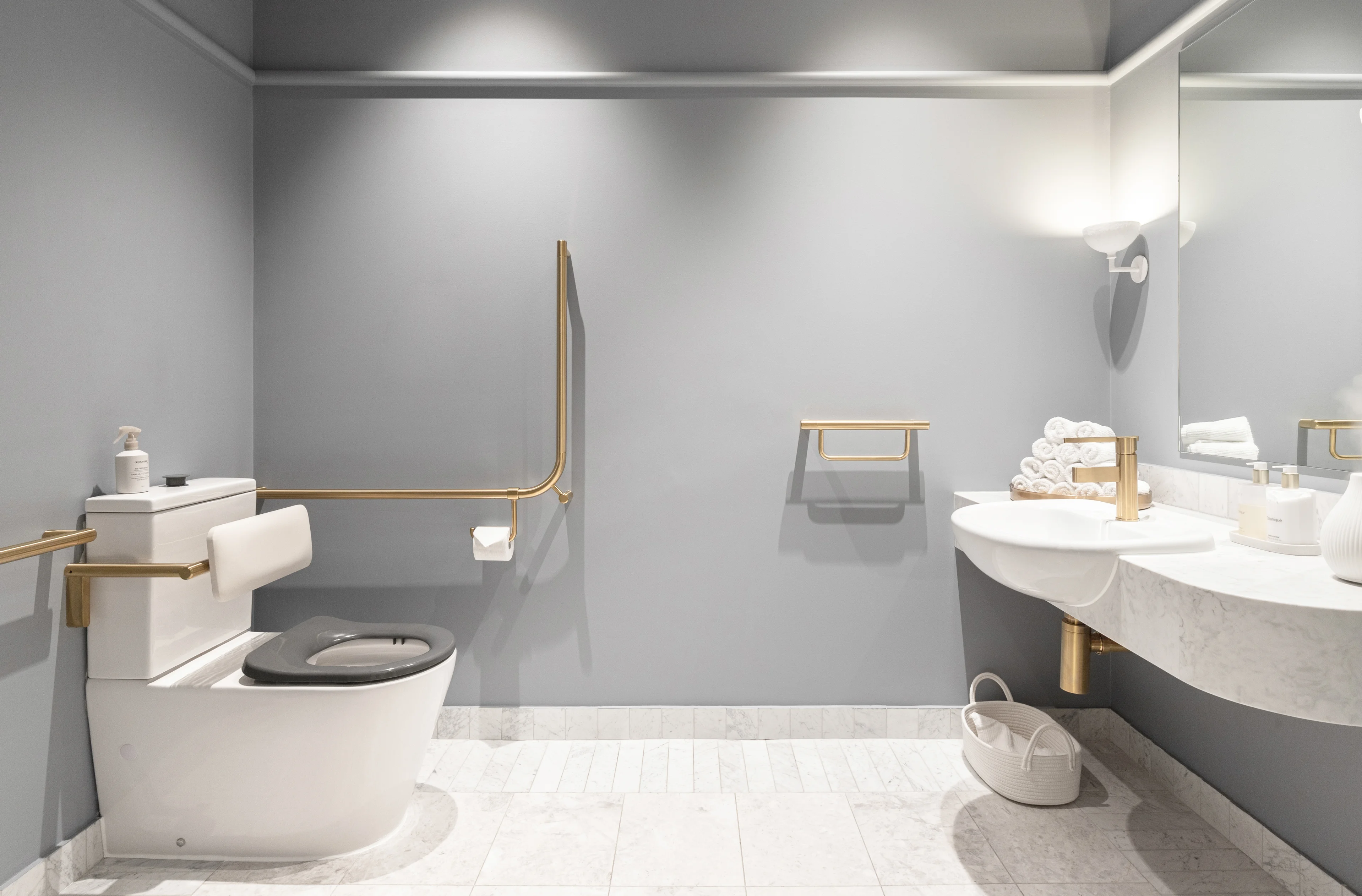
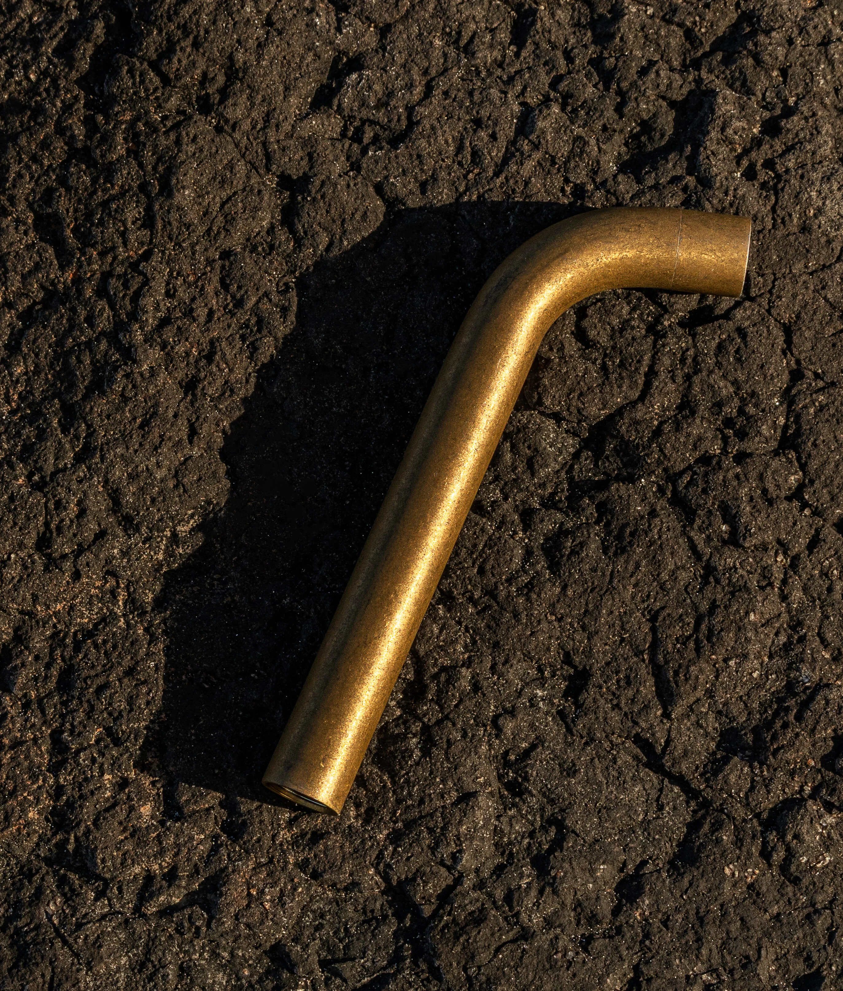
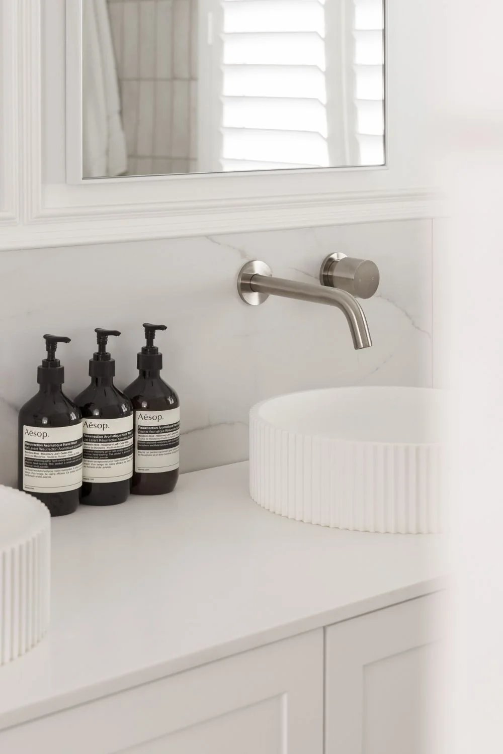
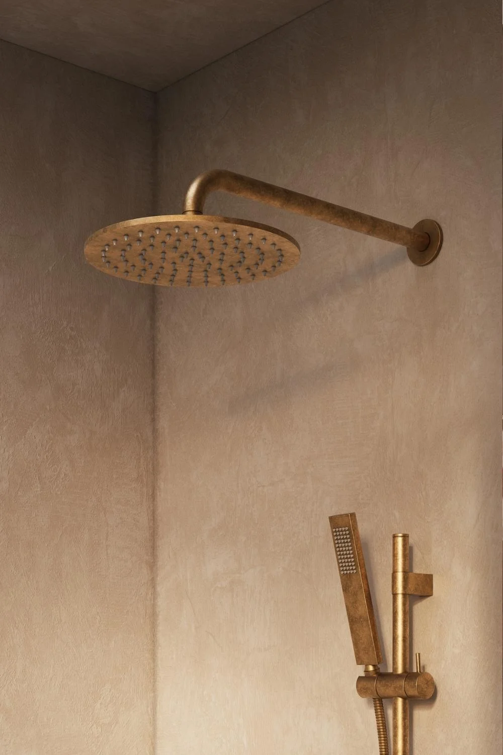
Silver & Metallic Accents
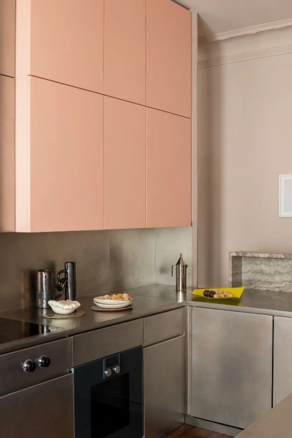
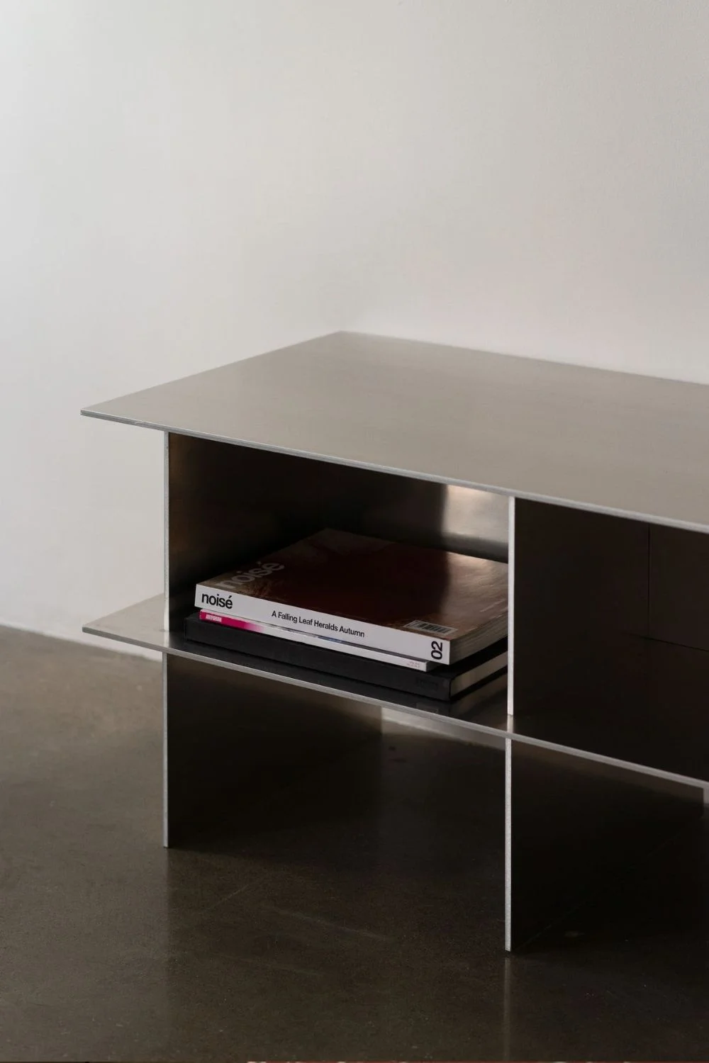
While brass and bronze have ruled for the better part of a decade, 2026 interior design trends are seeing a full-circle return to cooler metallics, and not just in hardware.
Designers are leaning heavily into silver, chrome, stainless steel, and brushed nickel as a way to bring a sleek, contemporary edge back into interiors.
This isn’t the sterile chrome of early-2000s bathrooms; it’s a more nuanced, European-influenced revival. Imagine the kind of polished silver platters you’d find in a cosy Copenhagen café, chrome sconces casting cool reflections across textured walls, and tableware that feels equal parts nostalgic and modern.
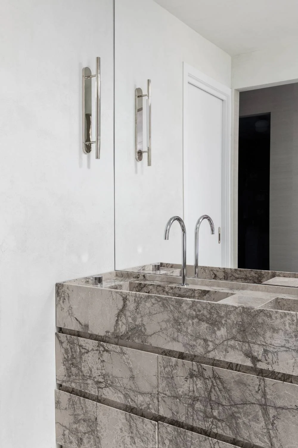

Homeowners are layering metallics in a way that feels collected rather than coordinated:
- Polished chrome for a clean, reflective finish
- Stainless steel for durability with a subtle industrial edge
- Brushed nickel for a softer, dimensional sheen
- Pewter and patinaed silver for a vintage, textural contrast
These finishes pair beautifully with the year’s broader themes: tactile textures, mixed wood tones, and the rise of deep blues. Whether used sparingly as accents or incorporated through lighting, barware, or bathroom fixtures, silver-based metals bring balance and brightness to the warm, earthy palettes that defined recent years.
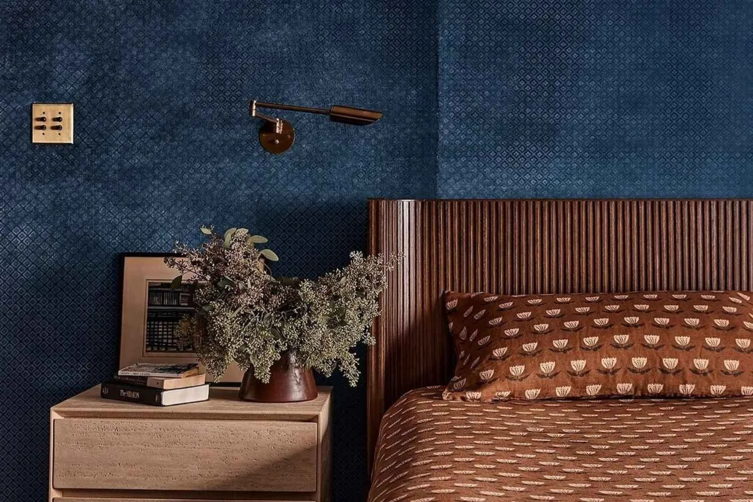
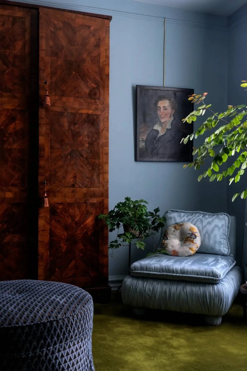
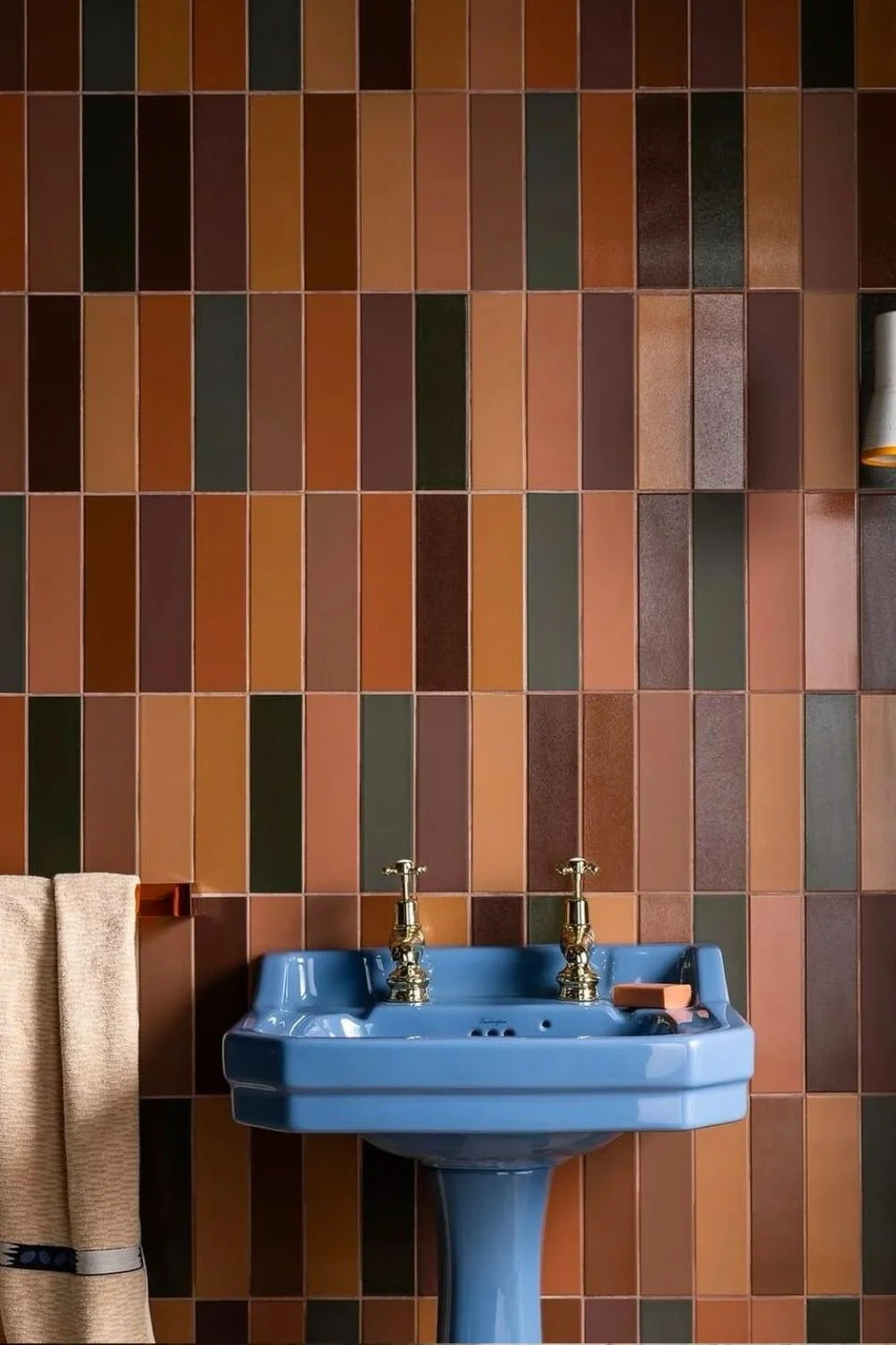
Shades of Blue
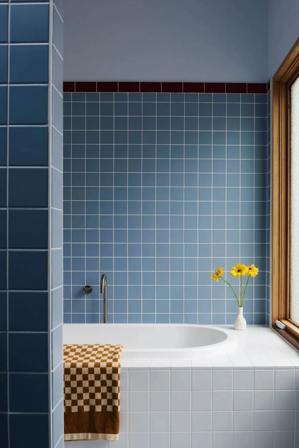
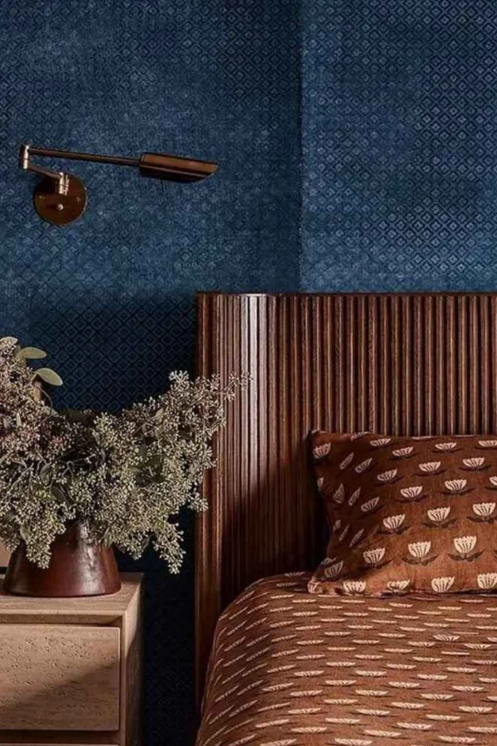
After several years of green leading the way, blue is stepping confidently into the spotlight as one of the latest interior trends for 2026. While soft sky blues have been quietly popular for some time, it’s the resurgence of richer, moodier blues that’s reshaping interiors for the year ahead.
From powder-blue bathroom vanities to deep navy libraries, blue’s versatility is what makes it so compelling: it can be calming, coastal, classic, or boldly contemporary. Designers are embracing it across cabinetry, upholstery, tiles, and full-room paint schemes, using its depth to create spaces that feel sophisticated yet safe.
Paint forecasts echo the shift. Dulux’s 2026 palette spotlights a trio of atmospheric blues, including the vibrant cobalt ‘Free Groove’ and the stormy grey-blue ‘Slow Swing.’ Other paint houses are leaning into teal, with new variations signalling a broader appetite for saturated, soulful hues. These colours add depth and character, especially when paired with soft neutrals such as warm off-whites, beige-taupes, or creamy tones on surrounding walls and backsplashes.
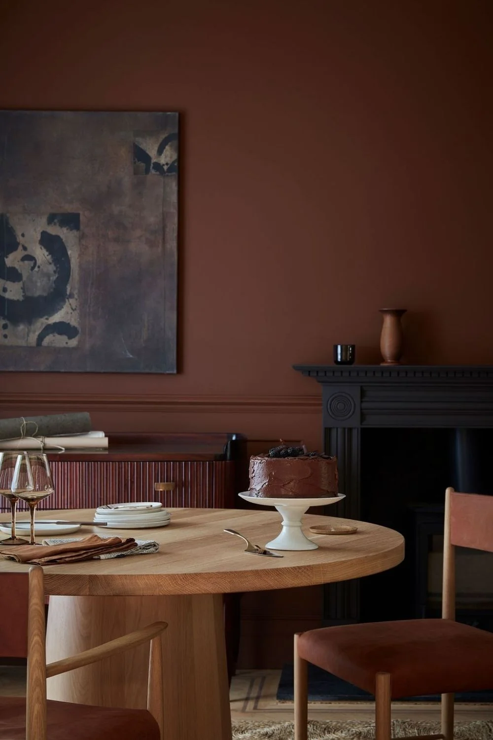
Blue also pairs beautifully with another rising trend: rich, chocolatey browns. After years of coffee and biscuit tones shaping interiors, homeowners are growing bolder, embracing deeper browns on walls, furniture, and textiles. These grounded, cocoa-toned shades balance blue’s coolness, creating palettes that feel warm, inviting, and effortlessly modern.
Whether used as an anchor colour or layered tonally throughout a room, blue is undeniably positioning itself as one of 2026’s defining colours.
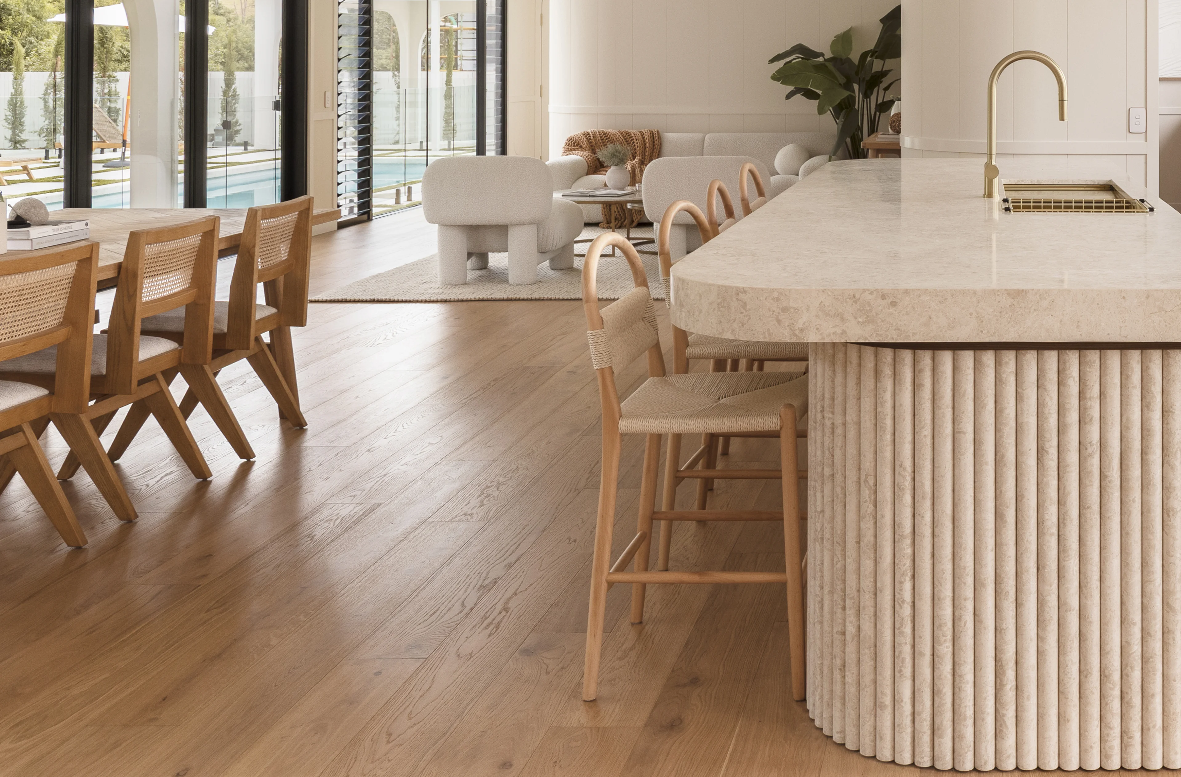
Tactile Textures

Texture will dominate in 2026, signalling a shift from uniformity to authenticity. This interior design trend celebrates spaces designed to be experienced through touch as much as sight, with surfaces you instinctively want to run your hands across.
Hand-painted walls, textural stone tiles, and linen that crumples naturally define a new design language rooted in sensory experience and lived-in comfort.
Texture is no longer a finishing touch; it’s the foundation of your space. Designers are layering materials such as velvet, cork, wool, rattan, and linen to build rooms that feel deeply lived-in. Think:
- Smooth stone and metal finishes contrasted with organic surfaces like concrete, microcement, handmade tiles, textural render, and timber for layered, lived-in depth.
- High-pile wool rugs anchoring open spaces
- Fringe-lined accent chairs adding movement
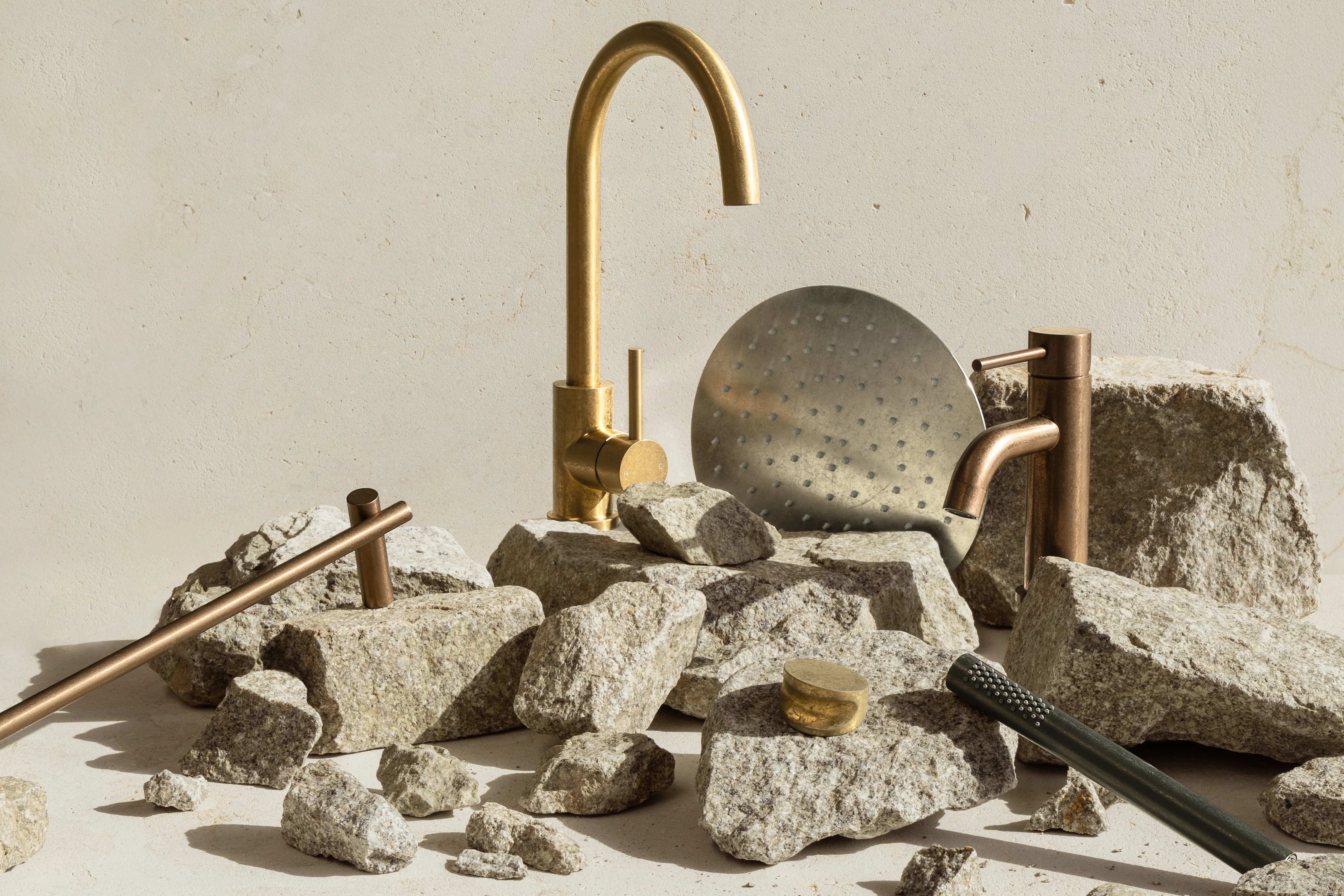
- Reeded tapware and hardware, such as our Namika Collection, bringing subtle tactility to everyday rituals
- Tumbled antique brass tapware and hardware providing a textural finish, rustic character, and natural patina that develops over time
- Velvet upholstery introducing a sense of luxury and indulgence
It’s this interplay between smooth and coarse, crisp and plush, that gives even the most minimal rooms their sense of depth and dimension.
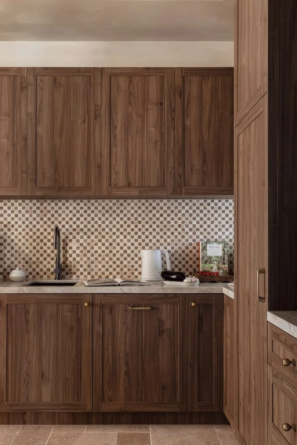
Pattern on Pattern
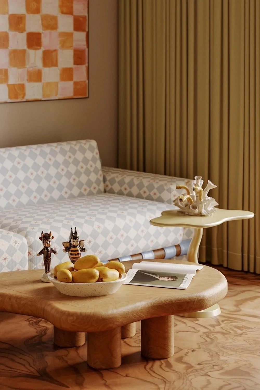

After forecasting its rise last year, pattern-layering is building even more momentum as one of the defining interior design trends for 2026. Wallpaper, upholstery, drapery, cushions: patterns are being mixed with intention and confidence. As homeowners become more comfortable with colour drenching, we’re seeing a natural evolution into pattern-drenching: repeating motifs across walls, furniture, and soft furnishings for a fully immersive effect.
Designers are embracing the idea that homes should feel collected, not uniform, and pattern is one of the most powerful tools for telling that story. Patterns making a comeback include:
- Checkerboard, reimagined in unexpected tones, oversized proportions, or textured stone and tile. The classic black-and-white grid is giving way to earthy neutrals, soft pastels, and high-contrast colour pairings that feel playful rather than retro.
- Stripes, predominantly vertical, are being used to elongate walls, introduce rhythm, and bring a subtle architectural quality to a room. Designers are experimenting with wide painterly stripes, pinstripe wallpapers, and striped upholstery that feel refined rather than nautical.
- Large-scale murals that serve as instant storytelling moments. Whether hand-painted or digitally printed, they turn a single wall into a focal point, wrapping spaces in landscape scenes, abstract forms, or expressive brushwork.
Throughout 2026, pattern will shift into a more archival, old-world direction, echoing the resurgence of heritage references in interiors, fashion, and pop culture.
Expect ornate botanicals, toiles, damasks, and oversized florals that feel lifted from a historic estate rather than a modern showroom. These elements bring vibrancy to already colourful rooms and inject personality into minimalist ones; even a single patterned chair or wallpaper-clad wall can transform the entire space.
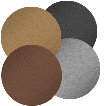
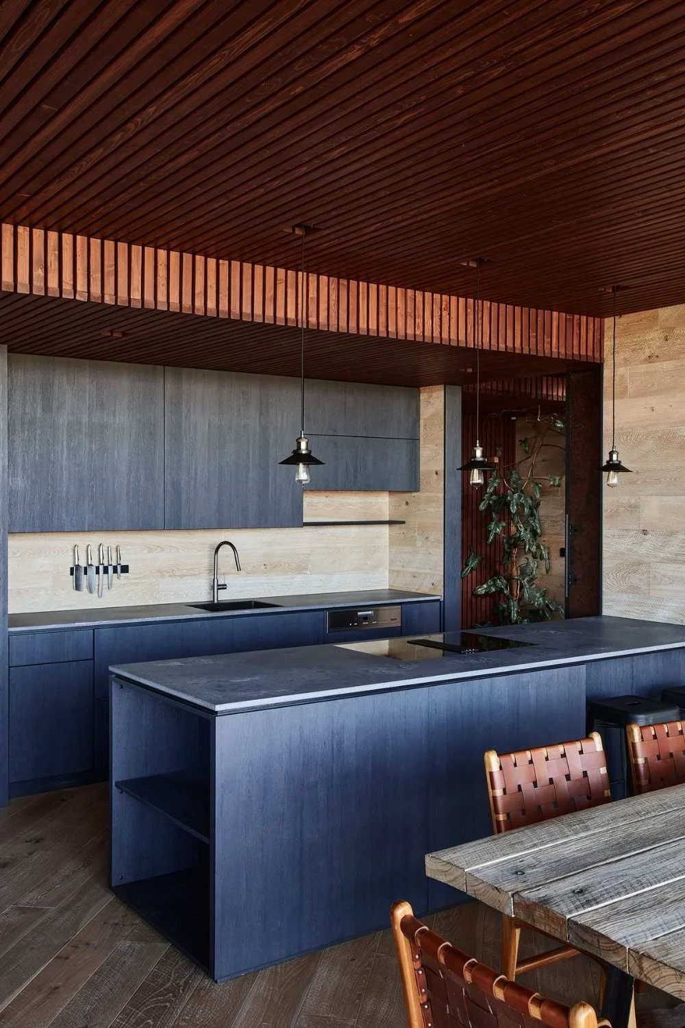
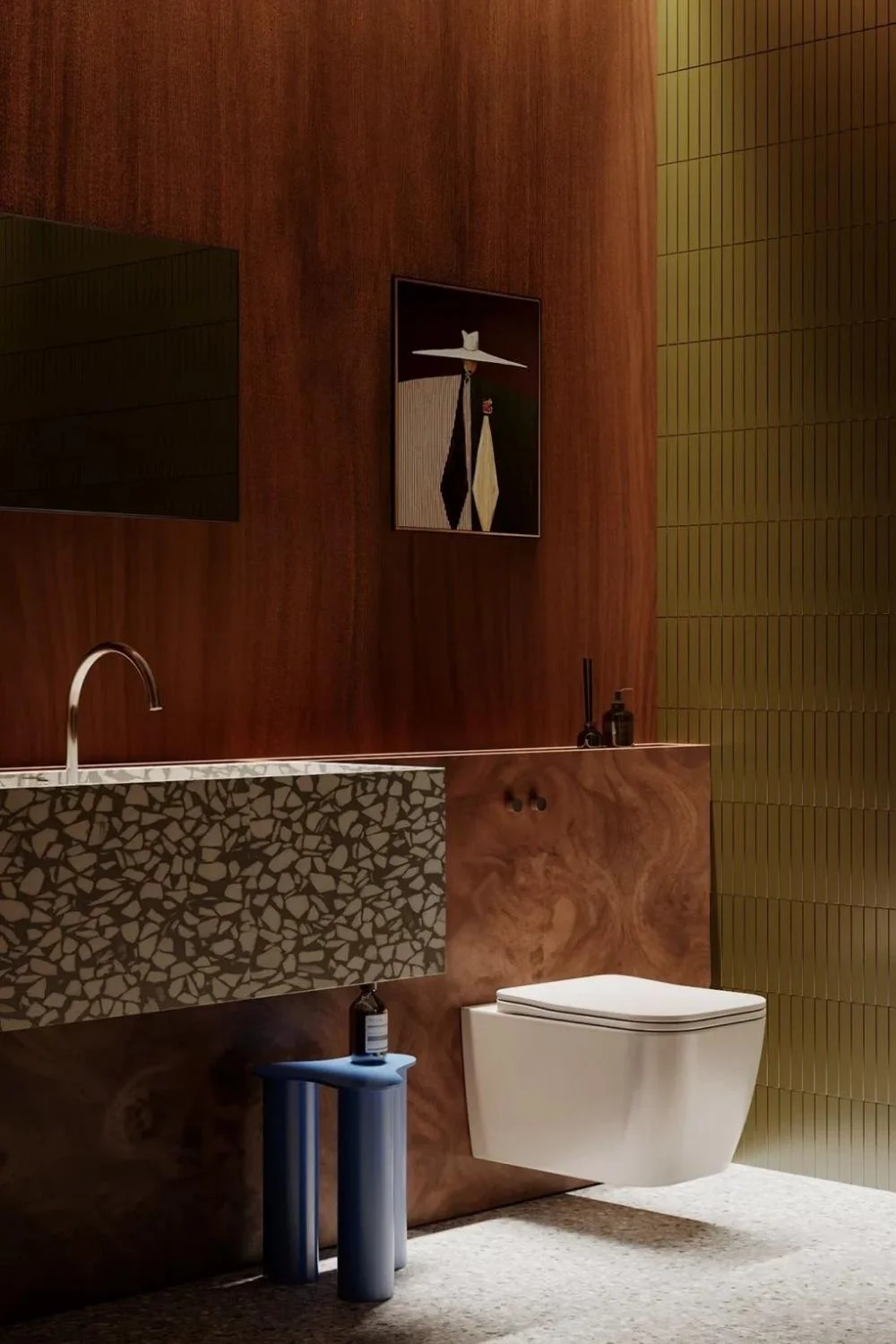
Mixed Wood Tones
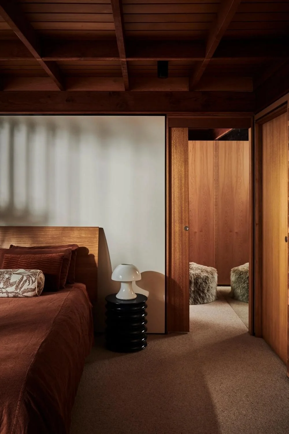
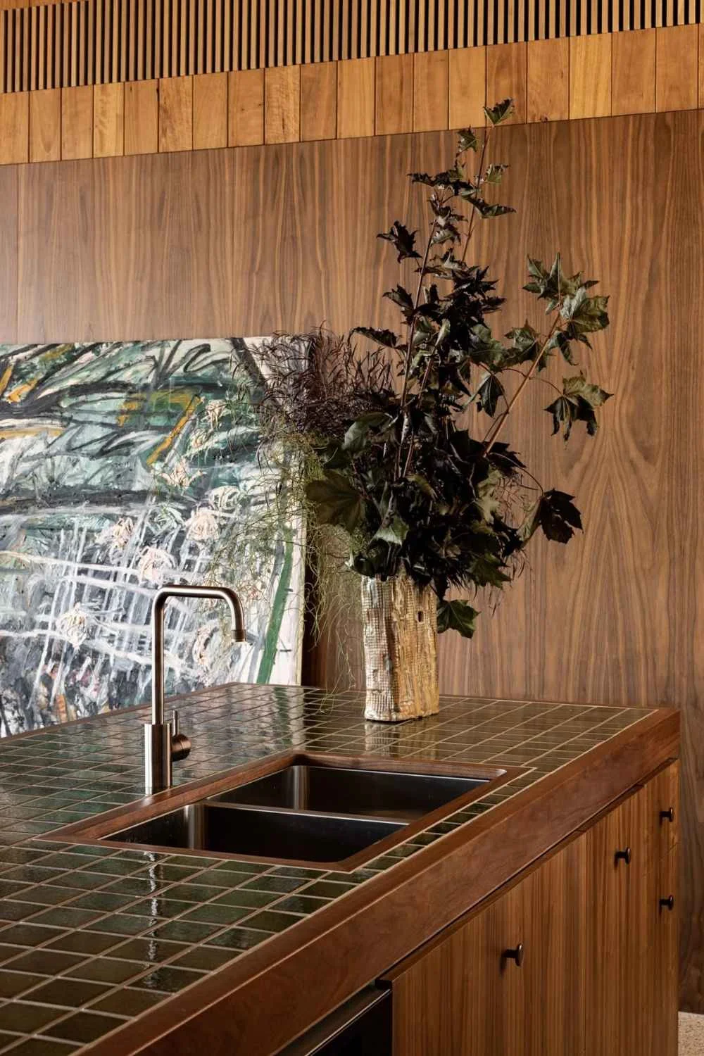
Darker timbers have been on the rise, but 2026 interior design trends are all about the mix. Designers are layering multiple wood types within the same space, adding depth, warmth, and character.
It’s a move that feels distinctly reminiscent of the 1970s, when timber-rich interiors and expressive panelling were hallmarks of considered design. Think fluted wall panelling, tongue-and-groove ceilings, stained oak trims wrapping a room, or even entire spaces drenched in timber.
The key to getting it right lies in undertones: pair cool with cool, warm with warm. Anchor the room with one dominant wood, then layer in complementary tones for balance rather than contrast overload.
Wood pairings that work beautifully include:
- Walnut and Light Oak: a classic combination of rich, chocolatey warmth with a soft, neutral counterpoint
- Cherry and Maple: warm red-toned cherry offsets the creamy, subtle warmth of maple for a balanced, elegant feel
- Walnut and Ash: deep walnut contrasts with pale, slightly grey-toned ash for visual depth
- Teak and Hickory: golden teak adds richness, while hickory’s textured grain brings character and variation
We’re shifting away from stark white everything and back into warmth and architectural soul, and mixed wood tones are central to that shift.
Interior design trends come and go, but thoughtful design endures. It’s important to take only what resonates with you from these forecasts, so your home reflects your personality and lifestyle rather than chasing every passing fad.
Feeling inspired for 2026? Read these blogs:
Elevate Your Space With These Bathroom Tile Ideas
Design Your Dream Wellness Space at Home: From a Sauna to a Home Gym
Modern Rustic Interior Design: Your Guide to Achieving the Look